| Author |
|
Greg Woronchak
Byrne Robotics Member

Joined: 04 September 2007
Location: Canada
Posts: 1631
|
| Posted: 19 February 2009 at 1:04pm | IP Logged | 1
|
|
|
One of the things that struck me when reading 'How to Draw Comics the Marvel Way' (many moons ago) was the use of a 'heroic' scale for drawing a human body; the reasoning that super-heroes are 'beyond' humanity and deserve stylized proportions made (and makes) alot of sense to me.
I've noticed that several of today's artists draw the human figure using very realistic proportions (which might be a side-effect of relying heavily on photo reference). I find that a super-hero drawn 'realistically' creates a weird affect, like trying to watch a 3D movie without the requisite glasses (but that's probably just me <g>).
What are your thoughts on the subject?
Edited by Greg Woronchak on 19 February 2009 at 1:04pm
|
| Back to Top |
profile
| search
| www
e-mail
|
| |
John Byrne

Grumpy Old Guy
Joined: 11 May 2005
Posts: 132537
|
| Posted: 19 February 2009 at 1:15pm | IP Logged | 2
|
|
|
The Alex Ross Effect. Superheroes should look like reg'lar folk wearing
home made costumes.
In which case, why bother?
One of the elements that has been slowly and steadily sucked out of comics
in the past 30 years or so is GRANDEUR. Quite deliberately, it seems, the
characters have been diminished. Perhaps it is a weird mutation of
what Stan and Jack and Steve began in the early days of the "Marvel Age".
Their characters were much more down to earth, much more human
than their DC counterparts.
Compare the First Coming of Galactus as rendered by Kirby and Sinnott�
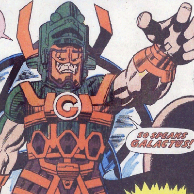
�to the same story in the hands of Ross (and remember I liked
MARVELS)�
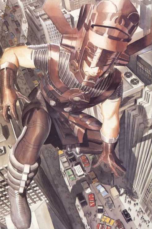
On the one hand (even allowing for the odd, original color scheme) we get a
massive figure who announces "Don't mess with me" just by standing there.
On the other, we get a rather skinny guy in a scaled down Galactus suit.
When drawing superheroics, it is good to keep the word "super" always in
mind!
|
| Back to Top |
profile
| search
|
| |
Craig Markley
Byrne Robotics Member

Joined: 16 April 2004
Location: United States
Posts: 3969
|
| Posted: 19 February 2009 at 1:23pm | IP Logged | 3
|
|
|
Is Galactus supposed to be floating in the Ross pic? I say this because it seems impossible to have one foot on top of a building while crouching on the other leg.
|
| Back to Top |
profile
| search
|
| |
John Byrne
Grumpy Old Guy
Joined: 11 May 2005
Posts: 132537
|
| Posted: 19 February 2009 at 1:24pm | IP Logged | 4
|
|
|
Yes, he is floating. Note the shadow of his hand.
|
| Back to Top |
profile
| search
|
| |
Trevor Smith
Byrne Robotics Member

Joined: 21 September 2006
Location: Canada
Posts: 3526
|
| Posted: 19 February 2009 at 1:25pm | IP Logged | 5
|
|
|
Yeah, the Galactus in the second pic is big, obviously,
but somehow at the same time neither imposing or grand.
Actually, looking further...rather than a giant in the
midst of a normal sized city, it looks like a normal guy
in a funny suit amongst some miniatures.
|
| Back to Top |
profile
| search
e-mail
|
| |
Paulo Pereira
Byrne Robotics Member
Joined: 24 April 2006
Posts: 15539
|
| Posted: 19 February 2009 at 1:30pm | IP Logged | 6
|
|
|
The Ross panel is beautifully illustrated but the figure isn't impressive apart from its size. In fact, it looks almost ridiculous, with the effect of an over-sized head. I can believe the former is unearthly, not so much with the latter. I also have to say, it was an odd choice of Ross's to pose the character that way.
Anyway, I'll take the Kirby Galactus (color scheme notwithstanding) every time.
Edited to add: superheroes with realistic proportions is also why I generally don't care for live action superhero movies. To me, superheroes ideally work best with the medium they were invented for, as well as animation.
Edited by Paulo Pereira on 19 February 2009 at 1:37pm
|
| Back to Top |
profile
| search
|
| |
John Byrne
Grumpy Old Guy
Joined: 11 May 2005
Posts: 132537
|
| Posted: 19 February 2009 at 1:37pm | IP Logged | 7
|
|
|
It would seem Ross was recreating this moment:
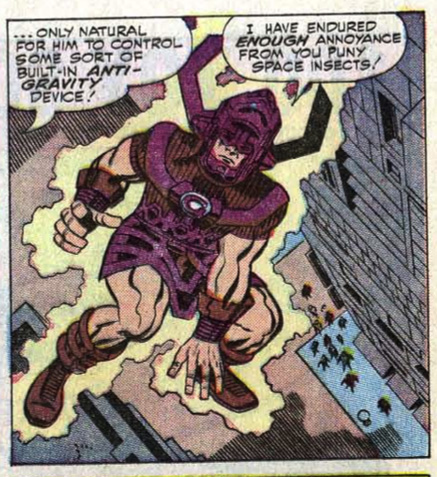
You can see here how Kirby's funky anatomy and perspective allowed him to
keep the mass of the figure, which is lost in Ross' photorealistic version.
|
| Back to Top |
profile
| search
|
| |
Paulo Pereira
Byrne Robotics Member
Joined: 24 April 2006
Posts: 15539
|
| Posted: 19 February 2009 at 1:39pm | IP Logged | 8
|
|
|
Yeah, the effect is completely lost. Ross's G just looks too human. I wonder why Ross left out the energy enveloping Galactus.
|
| Back to Top |
profile
| search
|
| |
Corey Johnson
Byrne Robotics Member
Joined: 16 April 2004
Location: United States
Posts: 2021
|
| Posted: 19 February 2009 at 1:42pm | IP Logged | 9
|
|
|
In the Ross pic, it almost looks like Galactus is being careful not to squish anyone--which would certainly be out of character as well.
|
| Back to Top |
profile
| search
|
| |
Martin Redmond
Byrne Robotics Member
Joined: 27 June 2006
Posts: 3882
|
| Posted: 19 February 2009 at 1:46pm | IP Logged | 10
|
|
|
He looks like a child lost in his toys.
|
| Back to Top |
profile
| search
|
| |
John Byrne
Grumpy Old Guy
Joined: 11 May 2005
Posts: 132537
|
| Posted: 19 February 2009 at 1:48pm | IP Logged | 11
|
|
|
Compare to�
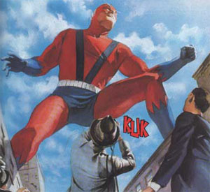
Wow!! Not for nothing did Marvel use that shot in promoting MARVELS.
(Altho, notice the left-left, right-right gaff. . . )
|
| Back to Top |
profile
| search
|
| |
Chris Geary
Byrne Robotics Member

Joined: 19 January 2009
Location: United Kingdom
Posts: 1158
|
| Posted: 19 February 2009 at 1:53pm | IP Logged | 12
|
|
|
As fantastic as that shot is, I always thought that Giant-Man would crush any buildings that he is standing on.
I wouldn't thought that whether it was realistic looking or not. But I think that I would've accepted it more if it was 'traditional'.
|
| Back to Top |
profile
| search
|
| |


