| Author |
|
Leigh Hunt
Byrne Robotics Member

Joined: 20 April 2004
Posts: 296
|
| Posted: 15 April 2007 at 2:59am | IP Logged | 1
|
|
|
Reminds me of that Astonishing X-men cover with Collossus on it. He was
resurrected in that issue. The scene on the inside would have had more
impact without that cover (I hadn't heard the spoilers)
------------------------------------------------------------ ------------------------------
Erm, you must have read a second printing then. The first printing had The Beast on the cover and didn't give away the surprise at all. I certainly didn't know when I read it.
|
| Back to Top |
profile
| search
|
| |
David Parker
Byrne Robotics Member
Joined: 13 January 2007
Posts: 375
|
| Posted: 15 April 2007 at 7:40am | IP Logged | 2
|
|
|
From what I can tell, it seems like there's a large chunk of the comic book reading public who view those old-style covers with captions and word balloons as "cheesy" and "goofy." Of course, to a certain degree, they are cheesy (especially those old Supeman and Lois Lane covers), but at least they're fun and interesting. Back in the days when comics were sold in spinner racks in real stores, those old-fashioned covers were probably neccessary. Nowdays, with most comics being sold in comic shops to a certain set of buyers, an interesting cover probably isn't as important to sales as they once were.
|
| Back to Top |
profile
| search
|
| |
Orlando Teuta Jr
Byrne Robotics Member

Joined: 17 April 2004
Location: United States
Posts: 1043
|
| Posted: 15 April 2007 at 7:51am | IP Logged | 3
|
|
|
I wonder if the generic covers draw in new readers at all. I haven't done any research, but the cover that got me to pick up my first Comic was this one (reprinted in Marvel Tales when I got it)

I was familliar with Spider-man and knew how important his secret ID was and knew the peril he was in. I had to buy it to see how it would play out.
|
| Back to Top |
profile
| search
|
| |
Michael Connell
Byrne Robotics Member
Joined: 13 January 2006
Posts: 4026
|
| Posted: 15 April 2007 at 8:22am | IP Logged | 4
|
|
|
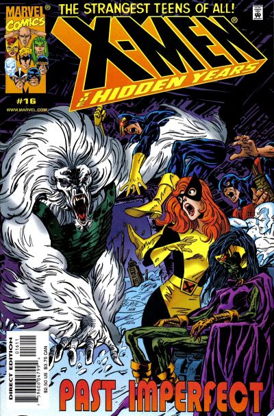
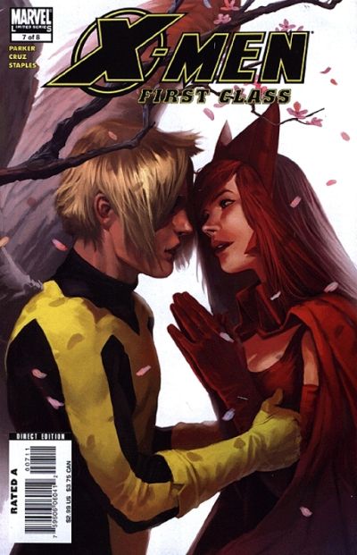
There is a big difference in covers no doubt. See to me this looks like an exciting comic book cover...
And this looks more like a Fleer X-Men trading card.
|
| Back to Top |
profile
| search
|
| |
James Hanson
Byrne Robotics Member
Joined: 14 February 2006
Posts: 2396
|
| Posted: 15 April 2007 at 8:24am | IP Logged | 5
|
|
|
Great examples, James! I'd want to pick up all three of those books
(especially that last one) if I saw them at my LCS.
Something that wasn't lost on JB.

|
| Back to Top |
profile
| search
|
| |
Aaron Smith
Byrne Robotics Member

Joined: 06 September 2006
Location: United States
Posts: 10461
|
| Posted: 15 April 2007 at 8:47am | IP Logged | 6
|
|
|
JB's Superman covers are among my favorite covers ever. They always made the books jump off the shelf.
|
| Back to Top |
profile
| search
| www
e-mail
|
| |
Don Zomberg
Byrne Robotics Member
Joined: 23 November 2005
Posts: 2355
|
| Posted: 15 April 2007 at 8:56am | IP Logged | 7
|
|
|
Daniel: "...Ultimate Spider-Man doesn't meet the first argument."
Never said it did. That's why I used Ultimate Spider-Man as MY example for generic covers, not John's.
|
| Back to Top |
profile
| search
|
| |
John Byrne
Grumpy Old Guy
Joined: 11 May 2005
Posts: 132330
|
| Posted: 15 April 2007 at 9:14am | IP Logged | 8
|
|
|
�this looks more like a Fleer X-Men trading card.
***
Not to mention looking like something you might
expect to see at the costume parade of a convention.
|
| Back to Top |
profile
| search
|
| |
Thom Price
Byrne Robotics Member
L’Homme Diabolique
Joined: 29 April 2004
Location: United States
Posts: 7593
|
| Posted: 15 April 2007 at 9:17am | IP Logged | 9
|
|
|
There was one aspect of 'action covers' that I often disliked: they tended to be disingenuous bordering on false advertising. So many of these covers promised things that simply weren't delivered within their pages. Yes, the cover did its job -- it tricked me into buying the book -- but it often left me disappointed that the hyperbolic cover wasn't reflected by the content of the book itself.
|
| Back to Top |
profile
| search
| www
e-mail
|
| |
Mark Spiridakis
Byrne Robotics Member

Joined: 28 March 2007
Location: United States
Posts: 176
|
| Posted: 15 April 2007 at 9:26am | IP Logged | 10
|
|
|
James Hanson wrote:
| In the sixties, Superman covers almost always had a situation that would at least get you curious. |
|
|
Those are some good examples of what a comic cover should be like, as are the JB covers. The cover should give something of an indicator of what is going on inside the comic, it should draw the reader in. Those posing covers say "look at me" when they should be saying "get a load of this."
The best thing is usually to depict an interpretation of what is going on inside the comic, it acts as a kind of a shorthand to the action. Maybe the cover scene didn't actually occur in the book itself but it gave a quick indicator of what was inside when the reader got a first look at it.
|
| Back to Top |
profile
| search
|
| |
James Hanson
Byrne Robotics Member
Joined: 14 February 2006
Posts: 2396
|
| Posted: 15 April 2007 at 9:32am | IP Logged | 11
|
|
|
There was one aspect of 'action covers' that I often disliked: they tended to
be disingenuous bordering on false advertising. So many of these covers
promised things that simply weren't delivered within their pages. Yes, the
cover did its job -- it tricked me into buying the book -- but it often left me
disappointed that the hyperbolic cover wasn't reflected by the content of the
book itself.
No one likes that. A lot of the time though, they deliver in some way. The JB
covers above all are pretty representative of what's going on in the book and
the same holds for the Silver Age Superman books I've read.
|
| Back to Top |
profile
| search
|
| |
John Byrne
Grumpy Old Guy
Joined: 11 May 2005
Posts: 132330
|
| Posted: 15 April 2007 at 9:43am | IP Logged | 12
|
|
|
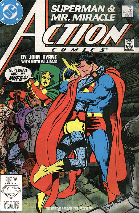
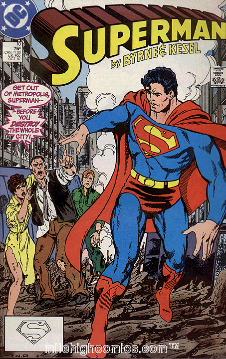
What a cover should do is give the potential reader some idea of what happens in the issue, without giving away vital points of the story. So, for instance, the ACTION, SUPERMAN and HIDDEN YEARS covers seen above do not feature actual scenes from the story, but they do give a pretty good idea of what the story is about. In other words, they (hopefully) get the reader to ask "What's going on here?"What's curious about the X-MEN: FIRST CLASS cover is that, aside from not being very good representations of the characters, it seems to be depending upon the viewer already knowing something of X-Men lore. Someone who might be Angel is about to kiss someone who might be the Scarlet Witch -- which raises a question in the reader's mind only if we already know this is something that didn't happen. (And, I must assume, if this is indeed that is happening, X-Men message boards are burning up with complaints about this "violation" of "continuity" -- right?) Now, when doing series set in the past, this is often the only way to tell interesting stories. One cannot really expect the reader to ask, for instance, "will the hero survive?", but one can (hopefully) get the reader to ask "how will the hero survive?" But such points are not good cover fare. They belong to the last page of the issue -- the page that is, done right, effectively an "ad" for the next issue.
|
| Back to Top |
profile
| search
|
| |


