| Author |
|
Tim O Neill
Byrne Robotics Security
Joined: 16 April 2004
Location: United States
Posts: 10926
|
| Posted: 07 November 2012 at 9:03am | IP Logged | 1
|
|
|
In stores today!
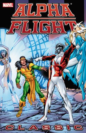
Collecting ALPHA FLIGHT #20-29 and INCREDIBLE HULK #313
|
| Back to Top |
profile
| search
|
| |
Ed Love
Byrne Robotics Member

Joined: 05 October 2004
Location: United States
Posts: 2712
|
| Posted: 07 November 2012 at 9:07am | IP Logged | 2
|
|
|
Really wish they wouldn't re-color the artwork for the covers. Pretty much shows off why I hate much of today's coloring
|
| Back to Top |
profile
| search
| www
|
| |
Marcel Chenier
Byrne Robotics Member

Joined: 19 May 2006
Location: United States
Posts: 2723
|
| Posted: 07 November 2012 at 9:11am | IP Logged | 3
|
|
|
You're right, Ed: everything seems to becoloured as if it were supposed to be a balloon!
|
| Back to Top |
profile
| search
|
| |
Matt Hawes
Byrne Robotics Member

Joined: 16 April 2004
Location: United States
Posts: 16430
|
| Posted: 07 November 2012 at 9:19am | IP Logged | 4
|
|
|
Cool news about the trade. I also have to agree about the coloring. It draws my eyes to background elements that really isn't what I am supposed to be focusing on in that picture. Do these new colorists even stop to consider that what they do is supposed to be in service of the art?
|
| Back to Top |
profile
| search
| www
|
| |
John Byrne
Grumpy Old Guy
Joined: 11 May 2005
Posts: 132288
|
| Posted: 07 November 2012 at 9:26am | IP Logged | 5
|
|
|
Do these new colorists even stop to consider that what they do is supposed to be in service of the art?�� HA! Take a look at the coloring on the SECOND trade's cover, and ask yourself that question! The original, and as "fixed" for the trade. . . 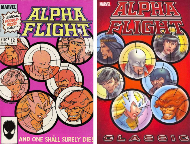
I'll admit, I wasn't crazy about that pink background when issue 12 was first released, but it looks like a Renaissance masterpiece in retrospect!
|
| Back to Top |
profile
| search
|
| |
Ray Brady
Byrne Robotics Member

Joined: 16 April 2004
Location: United States
Posts: 3740
|
| Posted: 07 November 2012 at 9:27am | IP Logged | 6
|
|
|
The cover's something of a spoiler, don't you think?
|
| Back to Top |
profile
| search
| www
|
| |
John Byrne
Grumpy Old Guy
Joined: 11 May 2005
Posts: 132288
|
| Posted: 07 November 2012 at 9:30am | IP Logged | 7
|
|
|
The cover's something of a spoiler, don't you think?�� Remember, when that cover was originally used on the comic, books were not being solicited months and months in advance. On the cover of a trade paperback, tho, which might be the first place some people see these stories. . . .
|
| Back to Top |
profile
| search
|
| |
Vinny Valenti
Byrne Robotics Member

Joined: 17 April 2004
Location: United States
Posts: 8030
|
| Posted: 07 November 2012 at 9:38am | IP Logged | 8
|
|
|
Yeah, that's mighty dumb. Why not use the cover to #25 instead, which could have functioned as a teaser for someone that hasn't read them yet?
|
| Back to Top |
profile
| search
|
| |
Matt Hawes
Byrne Robotics Member
Joined: 16 April 2004
Location: United States
Posts: 16430
|
| Posted: 07 November 2012 at 9:39am | IP Logged | 9
|
|
|
That retouch job on the top part of Shaman's head on the TPB cover JB posted bothers me everytime I see it. Did the get the least artisticly-inclined assistant in the offices to to that? The head band is way off!
|
| Back to Top |
profile
| search
| www
|
| |
Brad Krawchuk
Byrne Robotics Member

Joined: 19 June 2006
Location: Canada
Posts: 5819
|
| Posted: 07 November 2012 at 9:53am | IP Logged | 10
|
|
|
Well, now that they've got the trades completed, I guess I'll start the long wait for the inevitable Omnibus. That seems to be the order of production on these things, if the Byrne FF, Miller Daredevil, and Simonson Thor collections are anything from which to go on.
|
| Back to Top |
profile
| search
e-mail
|
| |
Ryan Maxwell
Byrne Robotics Member

Joined: 16 April 2004
Location: United States
Posts: 12937
|
| Posted: 07 November 2012 at 10:36am | IP Logged | 11
|
|
|
ESSENTIALS, please!!
|
| Back to Top |
profile
| search
e-mail
|
| |
Steven Legge
Byrne Robotics Member

Joined: 28 July 2012
Location: Canada
Posts: 866
|
| Posted: 07 November 2012 at 11:36am | IP Logged | 12
|
|
|
I would say the re-colouring on the book 3 cover is better than 2, but the highlights are not in line with where the strongest light source is. And some highlights/hotspots are in shadow areas(!?)
I used to think the pink cover was a little weird too, but side by side it's clearly a much better use of an intentional colour scheme as opposed to just colouring it in "normally".
|
| Back to Top |
profile
| search
| www
e-mail
|
| |


