| Author |
|
John Byrne

Grumpy Old Guy
Joined: 11 May 2005
Posts: 132282
|
| Posted: 26 July 2014 at 2:08pm | IP Logged | 1
|
|
|
I've been suggesting for some time that we all use @ for "irony" and/or sarcasm.
|
| Back to Top |
profile
| search
|
| |
Vinny Valenti
Byrne Robotics Member

Joined: 17 April 2004
Location: United States
Posts: 8030
|
| Posted: 26 July 2014 at 2:28pm | IP Logged | 2
|
|
|
My memory may be faulty, but I believe that Johnson was following Pacheco's
off-model, er, model of Ben Grimm. I seem to recall another issue that was
actually drawn by Pacheco (the r egular artist at the time)that had Grimm
looking like that.
|
| Back to Top |
profile
| search
|
| |
Mark Haslett
Byrne Robotics Member
Joined: 19 April 2004
Location: United States
Posts: 6103
|
| Posted: 26 July 2014 at 2:31pm | IP Logged | 3
|
|
|
Andrew: ..none of those people look like any member of the Fantastic Four..
**
And with that coloring, the sky doesn't look like sky, the dirt doesn't look like dirt, the clothing doesn't look like clothing... etc.
Comic Books... You've Come A Long Way, Baby!
|
| Back to Top |
profile
| search
|
| |
Eric Ladd
Byrne Robotics Member

Joined: 16 August 2004
Location: Canada
Posts: 4506
|
| Posted: 26 July 2014 at 3:44pm | IP Logged | 4
|
|
|
That is the model of Ben Grimm established earlier in the series by Carlos Pacheco. That page is definitely not his though. Despite the credits the biggest difference being how Pacheco drew the Thing. I love his style and paired with Merino for inking duties they are a very good team. Have a look at the covers starting with #35:
Fantastic Four 1998
The portly Ben Grimm was not a favorite change of mine during the Pacheco run, but there was some great art. I picked up a page from Jim Warden quite some time ago when he was in California.
|
| Back to Top |
profile
| search
|
| |
Manuel Soler
Byrne Robotics Member
Joined: 05 February 2011
Location: Spain
Posts: 211
|
| Posted: 26 July 2014 at 5:17pm | IP Logged | 5
|
|
|
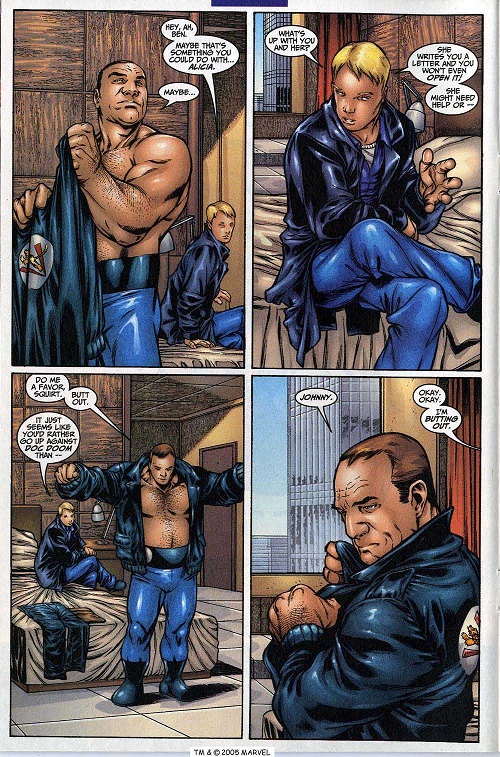
Well, when I said Pacheco was in the book, it was because he was the writer/plotter although he didn't draw all the issues. Perhaps the chosen page wasn't the better one but here another page from #40 by Pacheco.
|
| Back to Top |
profile
| search
e-mail
|
| |
John Byrne
Grumpy Old Guy
Joined: 11 May 2005
Posts: 132282
|
| Posted: 26 July 2014 at 7:30pm | IP Logged | 6
|
|
|
That idiot Jack Kirby! Just because he co-created the characters, he thought he knew how to draw them!
|
| Back to Top |
profile
| search
|
| |
Jason Larouse
Byrne Robotics Member
Joined: 10 May 2011
Posts: 515
|
| Posted: 26 July 2014 at 7:45pm | IP Logged | 7
|
|
|
Why is Johnny wearing Iron Man armor on that page
|
| Back to Top |
profile
| search
|
| |
Mark Haslett
Byrne Robotics Member
Joined: 19 April 2004
Location: United States
Posts: 6103
|
| Posted: 26 July 2014 at 9:20pm | IP Logged | 8
|
|
|
So weird to see, in that Pacheco art, the use of a whole page of old school 4-panel layout to tell what is basically 7 lines of dialogue... and NOTHING else.
|
| Back to Top |
profile
| search
|
| |
Koroush Ghazi
Byrne Robotics Member

Joined: 25 October 2009
Location: Australia
Posts: 1646
|
| Posted: 26 July 2014 at 10:04pm | IP Logged | 9
|
|
|
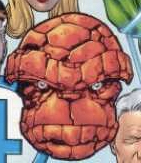
I don't think that second page of art really helps matters. I can't speak for anyone else, but to me those characters look completely unrecognizable as Johnny Storm and Ben Grimm.
|
| Back to Top |
profile
| search
e-mail
|
| |
Conrad Teves
Byrne Robotics Member
Joined: 28 January 2014
Location: United States
Posts: 2175
|
| Posted: 27 July 2014 at 4:35am | IP Logged | 10
|
|
|
In that second page, a lot of the problem for Johnny is in panel 2 with how the colorist gave highlights that suggest Johnny has chipmunk cheeks. And how he generally ignored the light in the rest of the scene.
Plus, why do so many colorists not use diffuse highlights for things that aren't shiny? The leather jacket in panel 4, nice. Johnny's pants in two? Not so much. Unless I'm misreading the scene and he's wearing silk pajamas.
|
| Back to Top |
profile
| search
| www
e-mail
|
| |
Eric Ladd
Byrne Robotics Member
Joined: 16 August 2004
Location: Canada
Posts: 4506
|
| Posted: 27 July 2014 at 5:01am | IP Logged | 11
|
|
|
The coloring was at times distracting, but remember that page was done in the late 90's. Merino's inks were very nice. Especially the textures he was creating.
|
| Back to Top |
profile
| search
|
| |
John Byrne
Grumpy Old Guy
Joined: 11 May 2005
Posts: 132282
|
| Posted: 27 July 2014 at 5:53am | IP Logged | 12
|
|
|
Plus, why do so many colorists not use diffuse highlights for things that aren't shiny? The leather jacket in panel 4, nice. Johnny's pants in two? Not so much. Unless I'm misreading the scene and he's wearing silk pajamas.�� I've been complaining about this for years. In CHAPTER ONE there was a page with Norman Osborn where he was apparently wearing green glass pants! Glass, when required, is another problem. Windex does not exist, as far as too many colorists are concerned. Windows and mirrors are fogged, almost every time!
|
| Back to Top |
profile
| search
|
| |


