| Author |
|
Greg Woronchak
Byrne Robotics Member

Joined: 04 September 2007
Location: Canada
Posts: 1631
|
| Posted: 23 June 2016 at 8:07am | IP Logged | 1
|
|
|
I miss how the contribution of the inker impacted how the pencils looked... it was a real collaboration.
It's a shame how the mentality behind pencils has changed so much; monthly comics should have stable creative teams to encourage readers to stick around!
|
| Back to Top |
profile
| search
| www
e-mail
|
| |
Greg Woronchak
Byrne Robotics Member
Joined: 04 September 2007
Location: Canada
Posts: 1631
|
| Posted: 23 June 2016 at 8:09am | IP Logged | 2
|
|
|
I'm imaging those Joe Madureira pages with high contrast, rich dark lines, and limited palette. I'm sure they'd look great!
|
| Back to Top |
profile
| search
| www
e-mail
|
| |
John Byrne

Grumpy Old Guy
Joined: 11 May 2005
Posts: 132278
|
| Posted: 23 June 2016 at 8:11am | IP Logged | 3
|
|
|
I miss how the contribution of the inker impacted how the pencils looked... it was a real collaboration. �� Strangely enough, it was rarely a true collaboration. Joe Sinnott told me it was years after they "worked together" that he met Jack Kirby for the first time. Terry Austin and I rarely communicated when we were "teamed" on X-MEN. Mostly it was guys working at home, miles, even states apart. And often the penciler was not at all happy with what the inker did. (Kirby was notoriously dissatisfied with Vinnie Colleta's inks.)
|
| Back to Top |
profile
| search
|
| |
Brian Miller
Byrne Robotics Member

Joined: 28 July 2004
Location: United States
Posts: 30897
|
| Posted: 23 June 2016 at 8:12am | IP Logged | 4
|
|
|
As were many pencillers, I'm sure.
|
| Back to Top |
profile
| search
|
| |
Stephen Churay
Byrne Robotics Member

Joined: 25 March 2009
Location: United States
Posts: 8369
|
| Posted: 23 June 2016 at 12:30pm | IP Logged | 5
|
|
|
The comic art market hasn't made this any
better. I think some pencilers see doing
the work for publication as secondary to
being able to sell the pages. Because of
that, they are creating super tight
pencils to increase the page value.
As to the colors, PS is a tool. It
requires a good colorist to use it, and
not one looking to make his or her own
statement. Just serve the artwork. And,
know the artist you're coloring, I think
helps too. There's artists out there who's
work is served well by modern coloring
techniques. Some artists' work look better
with flatter coloring. Generally, I think
older artists (prior to the Image
generation) look better with colors that
are more flat.
|
| Back to Top |
profile
| search
e-mail
|
| |
Steven Legge
Byrne Robotics Member

Joined: 28 July 2012
Location: Canada
Posts: 866
|
| Posted: 23 June 2016 at 4:19pm | IP Logged | 6
|
|
|
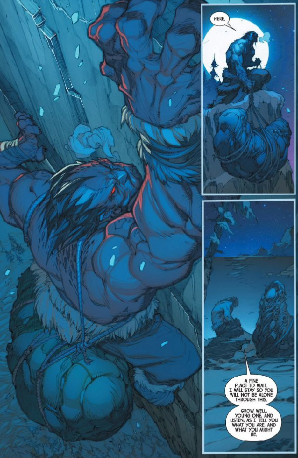
It looks like those pencils were super-tight for a stylistic reason, they weren't going to be inked.
This image looks much better than the one above, which looked like blue mud.
Edited by Steven Legge on 23 June 2016 at 4:21pm
|
| Back to Top |
profile
| search
| www
e-mail
|
| |
Joe Zhang
Byrne Robotics Member

Joined: 16 April 2004
Location: United States
Posts: 12857
|
| Posted: 23 June 2016 at 4:24pm | IP Logged | 7
|
|
|
Ugh, too much blue.
|
| Back to Top |
profile
| search
e-mail
|
| |
James Howell
Byrne Robotics Member

Joined: 23 September 2012
Location: United States
Posts: 363
|
| Posted: 23 June 2016 at 6:21pm | IP Logged | 8
|
|
|
Ugh, too much blue.
Exactly! Nothing stands out, the blues are too similar.
Plus, my scans are from the actual book, not from the web.
You have to color for print, not for a computer screen, if you don't, everything will be muddy, especially without blacks.
Every art teacher I've ever had always said, "Make sure your blacks stand out!"
Whether it was Life Drawing, or Cartooning/Comics, it didn't matter.
You want CLARITY in your work.
Frank Frazetta...
|
| Back to Top |
profile
| search
|
| |
John Byrne
Grumpy Old Guy
Joined: 11 May 2005
Posts: 132278
|
| Posted: 24 June 2016 at 4:49am | IP Logged | 9
|
|
|
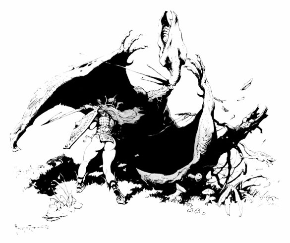
Ah, Frazetta! When he was good, he was very, very good, and when he was bad he was still better than almost anybody else!(That first piece is amusing. Eowyn vs the King of the Nazg�l. Not QUITE how Tolkien imagined it, I suspect. Especially since she was passing herself off as a man at that point!)
|
| Back to Top |
profile
| search
|
| |
Jan Bentzen
Byrne Robotics Member

Joined: 04 May 2004
Location: Denmark
Posts: 78
|
| Posted: 24 June 2016 at 2:03pm | IP Logged | 10
|
|
|
This is how you colour comics - done by a fan "David" - I�m afraid Marvel wont use it in the MOKF Omnibus vol. 2.
Gulacy.com / art galleries / Marvel / MOKF # 40.
(Sorry - no idea how to post this otherwise)
Edited by Jan Bentzen on 24 June 2016 at 2:30pm
|
| Back to Top |
profile
| search
|
| |
Tim Cousar
Byrne Robotics Member

Joined: 12 May 2006
Location: United States
Posts: 1663
|
| Posted: 24 June 2016 at 2:45pm | IP Logged | 11
|
|
|
Here's a link, Jan.
|
| Back to Top |
profile
| search
|
| |
Jan Bentzen
Byrne Robotics Member
Joined: 04 May 2004
Location: Denmark
Posts: 78
|
| Posted: 24 June 2016 at 3:21pm | IP Logged | 12
|
|
|
Thanks Tim.
This is my favorite Paul Gulacy issue of all time - and this is how the colours should be handled. No dull reprint colours like Marvel uses, and no shining computer colouring that normally ruins a comic. (Like in the Dark Horse reprints of Conan by Barry Windsor-Smith)
|
| Back to Top |
profile
| search
|
| |


