| Author |
|
Don Zomberg
Byrne Robotics Member

Joined: 23 November 2005
Posts: 2355
|
| Posted: 16 April 2017 at 7:41am | IP Logged | 1
|
|
|
The distressed look is random for these pieces. Some they scratch up, others they don't.
|
| Back to Top |
profile
| search
|
| |
Christopher Frost
Byrne Robotics Member
Joined: 24 October 2016
Location: Canada
Posts: 484
|
| Posted: 16 April 2017 at 8:33pm | IP Logged | 2
|
|
|
The "distressed" thing is about trying to make modern merchandise look vintage by giving it an aged look. This is why you see a lot of things like t-shirts and prints with scratched/faded appearances these days. Younger folks want to have older looking geek stuff without actually having to track anything down beyond what the local stores sell. I think it's lame, but to each their own, I suppose.
|
| Back to Top |
profile
| search
|
| |
Bill Collins
Byrne Robotics Member

Joined: 26 May 2005
Location: England
Posts: 11247
|
| Posted: 16 April 2017 at 10:03pm | IP Logged | 3
|
|
|
If i buy something new,i want it to look new!
|
| Back to Top |
profile
| search
e-mail
|
| |
Christopher Frost
Byrne Robotics Member
Joined: 24 October 2016
Location: Canada
Posts: 484
|
| Posted: 17 April 2017 at 8:43am | IP Logged | 4
|
|
|
Yes, but you're not a hipster millennial.
|
| Back to Top |
profile
| search
|
| |
John Byrne
Grumpy Old Guy
Joined: 11 May 2005
Posts: 132240
|
| Posted: 17 April 2017 at 9:07am | IP Logged | 5
|
|
|
My first novel, FEARBOOK, was given a "distressed" cover, painted to look scuffed and folded. I actually saw one young woman going thru the copies on the rack, looking, as she told me, for a good one. I don't explained what she was seeing, and she thought it was totally stupid.
|
| Back to Top |
profile
| search
|
| |
Shane Matlock
Byrne Robotics Member
Joined: 12 August 2012
Location: United States
Posts: 1760
|
| Posted: 17 April 2017 at 1:26pm | IP Logged | 6
|
|
|
I'm actually fond of some of the distressed look t-shirts. I'm wearing a Captain America one now. But if it's art for the wall I'd rather it look like the way it was originally printed. In the case of Fear Book, that was the way it was intended to look originally. I've seen several comics do stuff like that over the years, have the books look intentionally yellowed with homages of artists of that era and what not. I don't mind that at all because that's the way they wanted it to look. But giving a distressed look to a comic cover that didn't originally have it seems kind of silly and kind of ruins the art. It doesn't look so much vintage and just like it's been attacked by a cat. Although I guess there must be a market for it or they wouldn't be making them this way.
|
| Back to Top |
profile
| search
|
| |
Josh Goldberg
Byrne Robotics Member

Joined: 25 October 2005
Location: United States
Posts: 2065
|
| Posted: 17 April 2017 at 1:51pm | IP Logged | 7
|
|
|
I hate the "distressed" look.
|
| Back to Top |
profile
| search
|
| |
Brian Floyd
Byrne Robotics Member

Joined: 07 July 2006
Location: United States
Posts: 8349
|
| Posted: 17 April 2017 at 2:53pm | IP Logged | 8
|
|
|
I don't mind the distressed look on certain things. The cover pics being distressed is no big deal to me. I've even seen some distressed furniture that I liked. But I don't like distressed looking clothing. And that includes accessories, such as hats.
|
| Back to Top |
profile
| search
e-mail
|
| |
Andy Mokler
Byrne Robotics Member

Joined: 20 January 2006
Location: United States
Posts: 2799
|
| Posted: 17 April 2017 at 10:08pm | IP Logged | 9
|
|
|
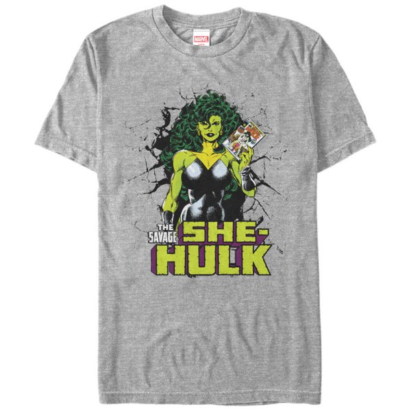
Have two different JB She-Hulk shirts from back in high school(1988) but those mediums just don't fit anymore. Got this XL from ebay. I hope JB gets his cut. Granted, she shouldn't be "savage" she should be "sensational" and I'm not that big of a fan of gray shirts, but it's a JB She-Hulk #1 and that counts for a lot.
|
| Back to Top |
profile
| search
e-mail
|
| |
Shane Matlock
Byrne Robotics Member
Joined: 12 August 2012
Location: United States
Posts: 1760
|
| Posted: 18 April 2017 at 12:24am | IP Logged | 10
|
|
|
Cool t-shirt, Andy!
|
| Back to Top |
profile
| search
|
| |
Bill Collins
Byrne Robotics Member
Joined: 26 May 2005
Location: England
Posts: 11247
|
| Posted: 18 April 2017 at 12:24am | IP Logged | 11
|
|
|
That`s a great shirt Andy,i love the grey though! After
a lifetime of wearing black rock t-shirts i like it when
black or white t-shirts have a great design on them,it
makes a nice change!
|
| Back to Top |
profile
| search
e-mail
|
| |
Tim O Neill
Byrne Robotics Security
Joined: 16 April 2004
Location: United States
Posts: 10924
|
| Posted: 18 April 2017 at 8:17am | IP Logged | 12
|
|
|
I have that Captain America JB print on my wall - I picked it up about a year ago. I bought it the moment I saw it, and it was a good thing because they were wiped out pretty fast. It hangs next to a similar print of AMAZING SPIER-MAN #50, which is John Romita Sr.'s "Spider-Man No More!" cover - so you are in good company, JB!
What I really like about this specific print is that it is silkscreened on canvas, and the wood that it is mounted on is about 1.25" thick, so it looks great on the wall.
Marvel has also made comic cover that are printed directly on wood. The colors are really good, and some of them are not distressed. The only JB cover that I have seen in this format is the "Let the Wookie Win" STAR WARS cover. I snapped that up as well!
|
| Back to Top |
profile
| search
|
| |