| Posted: 19 December 2023 at 5:12pm | IP Logged | 2
|
post reply
|
|
I was asked to do the album cover for a friend of mine, and decided I wanted to try to do a Maxfield Parrish-inspired night scene with complementary blues and yellows. Which is a little odd, since while I admire Parrish's technique, he's not really in my firmament AND trying to do something in that vein is so far outside of my wheelhouse it's a bit like trying to climb Everest without having ever mountaineered before (and without equipment).
Thought I'd show both the finished product and the process artifacts. Here's the final, first - watercolor, 18" square:
And here's the process stuff (which is maybe more fascinating to me than the final, in some ways).
1) Initial thumbnail (about 2 1/2" square) - her album was partly inspired by her first read of Sandman, so I decided to do some dream imagery. The general concept came pretty instantly after the first listen, though I obviously needed to describe to her what she was looking at:
2) Then I did a scaled up tracing of that for a color study, about 9" square. I knew I was doing the final in full color with minimal to no line work, but I really can only solve problems if I work through them in line, first - I'm a cartoonist, not an illustrator:
3) Then a color version of that (these are all on tracing vellum, btw):
4) Comped the two prep sketches together in Photoshop - still on the fence at this point about incorporating pen and ink into the final:
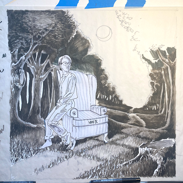
5) Next step was to do the comp drawing at the size of the final. I still had to solve some of the perspective issues, as the initial doodle was pretty flat, and in particular I needed to get photo reference from her in the pose, so while I was already up against the deadline at this point, I did a pretty involved graytone version with my beloved (and now pretty dried out) Faber Castell Pitt brush pens. I wasn't sure about the scale of the figure and chair in the final, so I made copies at different scales, cut out, and dropped in like Colorforms. This one is a 100% of my original - I ended up going with 115% for the final:

6) Lastly, I did a full line-art version for transfer to the watercolor paper, tweaking the perspective on the chair and pushing the left hand treeline back a bit to give the whole thing a little more depth (and to not make it look like the trees were ten feet tall). While I did like the claustrophobic vibe of having everything near the foreground, it really did need the depth to bring the viewer in. The door also got pushed back to make sure it read as a full-sized door:
|


