| Posted: 05 September 2011 at 9:55pm | IP Logged | 5
|
post reply
|
|
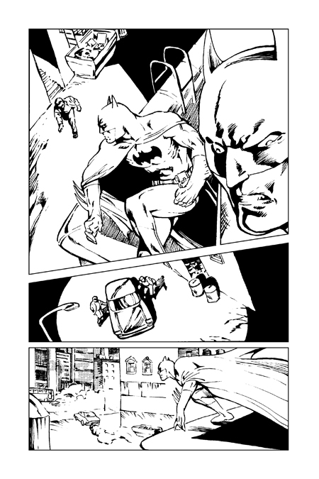
Ah, Trevor... Such a hit of nostalgia there... My favorite Robotman design... (I, of course, saw it years before I'd ever seen any Rog 2000...) Nicely done! Bill Wiist, your pages just get better and better. Commendable work, sir. Michael Bergkvist, I like your work very much. There seems to be a strong Jerry Bingham vibe to it. I would recommend that you occasionally allow the characters to fill the panels a little better, or otherwise fill some of the negative space with background or design elements. In the page above, for instance, the figure of Batman in panel one could be made larger. The car in panel three could be re-oriented to fill the space better. And while I very much enjoy the manner in which Batman in launching himself in pursuit of the vehicle, (reminiscent of Don Newton, I think) the background isn't believably rendered enough to tell the story as effectively as it otherwise might. Also, if you'll permit, the reality of the alleyway is not firmly established as far as consistency and lighting goes. If the streetlight we see is the only light source, the circle it casts isn't large enough to light panel one as it is shown. Also the streetlight seems a little too short, especially if the building wall in panel three is supposed to be the building upon which Batman is standing. In panel four, the sketchily rendered building with the dumpster is presumably the same building we see in panel one, yet it is now quite distant from the one on which the Batman is standing. I may have misread your intent with the spacing of these elements, but the art doesn't give me enough information, I think, to read it otherwise. While the individual panels are fairly well designed, the alleyway in panel one doesn't look like the same alley as in panel three, nor can it be the alley in panel four. The design of the panels should operate in relation to one another in establishing the sense of place. Just some observations, and I acknowledge that I may be off in my reading of this. I nevertheless wanted to offer some, I hope, constructive criticism. I do like what I see here overall. Yours is a very "classic" Batman.
Edited by Brian Hague on 05 September 2011 at 9:57pm
|