| Author |
|
Carmen Bernardo
Byrne Robotics Member

Joined: 08 August 2006
Location: United States
Posts: 3666
|
| Posted: 18 September 2012 at 4:56am | IP Logged | 1
|
post reply
|
|
Pretty good one there, Sebastien. Hope the recipient is enoying this. A cropping of my latest little project, featuring an original character of mine. 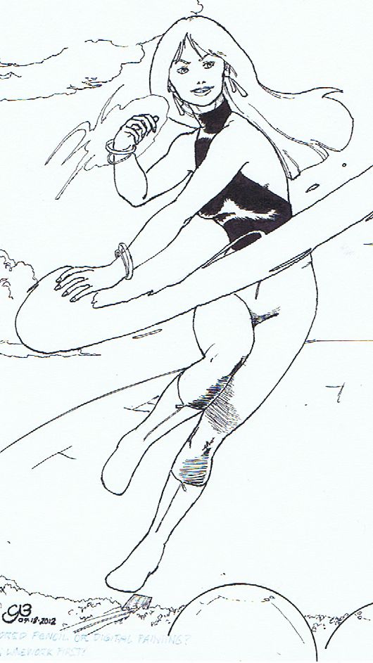
I used traditional inks on this (I'm holding off on Manga Studio until I have disposable income that I can use for purchasing it), Pelikan fount India ink with various nibs and brushes, with an old Prismacolor line marker for a couple of domes near the bottom of the piece. The final phase will be twofold: digital coloring in PSPx4, and hand coloring with a selection of Prismacolor and Derwent pencils.
|
| Back to Top |
profile
| search
|
| |
Ronald Joseph
Byrne Robotics Member

Joined: 18 April 2011
Location: United States
Posts: 1781
|
| Posted: 22 September 2012 at 3:27pm | IP Logged | 2
|
post reply
|
|
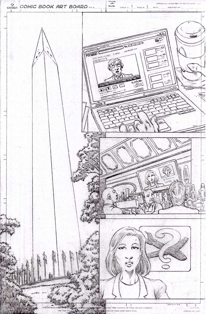
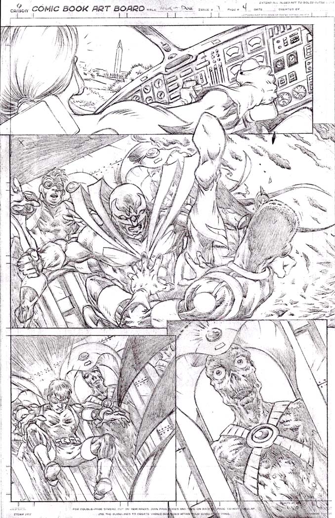
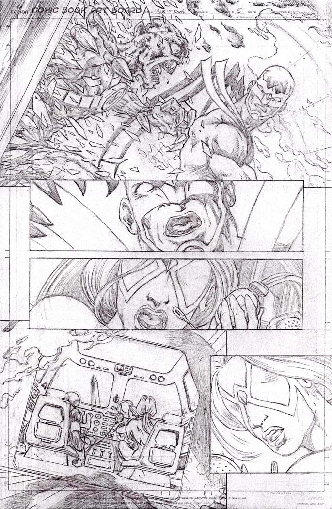
Just finished this yesterday. I used the script from the Nu52 Hawk & Dove #1 as my guide...
|
| Back to Top |
profile
| search
| www
e-mail
|
| |
Carmen Bernardo
Byrne Robotics Member
Joined: 08 August 2006
Location: United States
Posts: 3666
|
| Posted: 22 September 2012 at 7:13pm | IP Logged | 3
|
post reply
|
|
Wow, Ronald! That's some pretty nifty storytelling there. I'm getting something like a cross between an Alan Davis and a George Perez vibe in your style. The only thing that probably throws me off is the "breaking the image area" on each page, but that's just my preferences in page layout. In the meantime, I'll post a few that I was keeping myself busy on this past week: 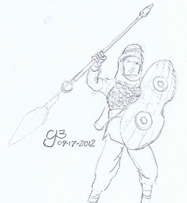
|
| Back to Top |
profile
| search
|
| |
Carmen Bernardo
Byrne Robotics Member
Joined: 08 August 2006
Location: United States
Posts: 3666
|
| Posted: 22 September 2012 at 7:16pm | IP Logged | 4
|
post reply
|
|
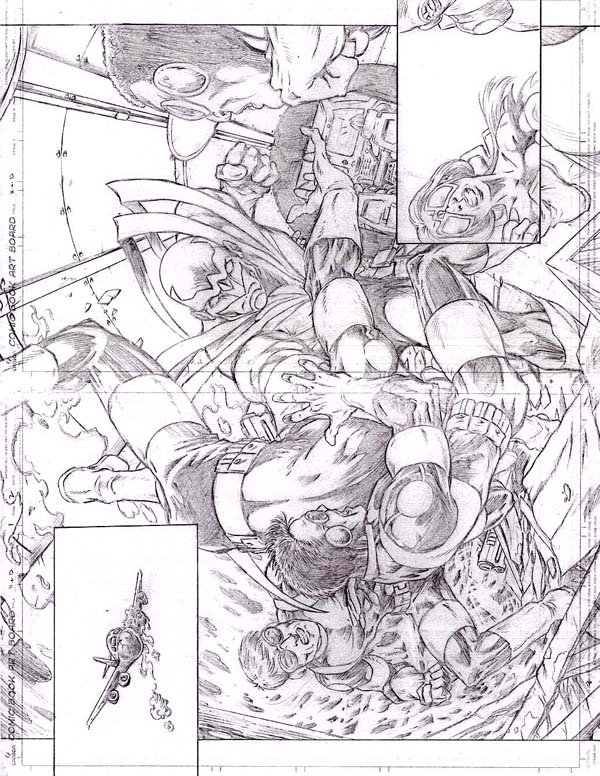
This one I had always had in my roster of villains for a series of comics that I've envisioned since I was a kid. Basically, he's the angry scientist type who has an accident that turns him into a cosmic monster that the heroes have to defeat in order to save the world. 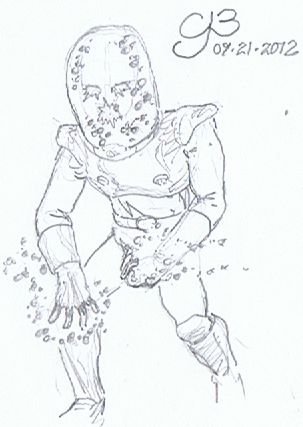
|
| Back to Top |
profile
| search
|
| |
Carmen Bernardo
Byrne Robotics Member
Joined: 08 August 2006
Location: United States
Posts: 3666
|
| Posted: 22 September 2012 at 7:17pm | IP Logged | 5
|
post reply
|
|
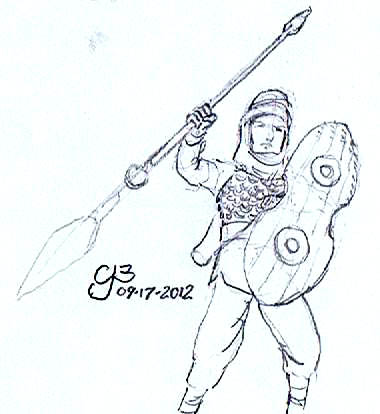
A new antagonist that I dreamed up for my hero team. This one being the leader of a squadron of cyborg super-soldiers they battle when going after an even bigger group of bad guys. 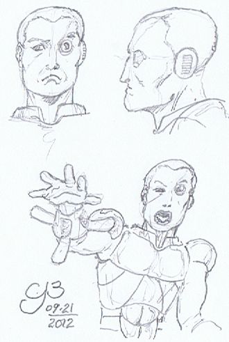
|
| Back to Top |
profile
| search
|
| |
Carmen Bernardo
Byrne Robotics Member
Joined: 08 August 2006
Location: United States
Posts: 3666
|
| Posted: 22 September 2012 at 7:19pm | IP Logged | 6
|
post reply
|
|
The Hulk-analog for my superhero universe. 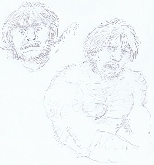
|
| Back to Top |
profile
| search
|
| |
Ronald Joseph
Byrne Robotics Member
Joined: 18 April 2011
Location: United States
Posts: 1781
|
| Posted: 24 September 2012 at 1:34pm | IP Logged | 7
|
post reply
|
|
Wow, Ronald! That's some pretty nifty storytelling there. I'm getting something like a cross between an Alan Davis and a George Perez vibe in your style.
Damn, a Davis and Perez vibe? Awesome! Thanks very much! I've been sending these pages - along with some other stuff - out to different publishers all morning. I hope someone likes them!
Y'know, I've been meaning to ask you - what are you using to get your pics online? Are you scanning them? I like them, but I think if you adjusted the contrast on the images, the lines would darken and they'd pop out at the viewer more. Do you use PhotoShop?
|
| Back to Top |
profile
| search
| www
e-mail
|
| |
Ronald Joseph
Byrne Robotics Member
Joined: 18 April 2011
Location: United States
Posts: 1781
|
| Posted: 24 September 2012 at 1:37pm | IP Logged | 8
|
post reply
|
|
See what I mean?
I hope it was Ok that I did this. I left the lightness setting at 0 and just upped the contrast to 60.
|
| Back to Top |
profile
| search
| www
e-mail
|
| |
Carmen Bernardo
Byrne Robotics Member
Joined: 08 August 2006
Location: United States
Posts: 3666
|
| Posted: 24 September 2012 at 3:21pm | IP Logged | 9
|
post reply
|
|
I use Corel Paint Shop Pro x4. I've pretty muched used that since switching over from the old Photo-PAINT software package that Corel used to put out back in the 1990s. You could call it the "Poor Man's Photoshop", but it gets the job done. I thought that they stood out well enough for me, but then my eyes are a little different and the big scanner (a Brother MFC-6490CW model) seems to pick up the lines well enough without the need for using a histogram adjustment. I know that I used it on blue line pencil sketches to make them pop out better. I guess I'm being a bit light on the softer graphite that I use now.
|
| Back to Top |
profile
| search
|
| |
Jeffery Tolbird
Byrne Robotics Member

Joined: 06 November 2006
Location: United States
Posts: 178
|
| Posted: 24 September 2012 at 5:49pm | IP Logged | 10
|
post reply
|
|
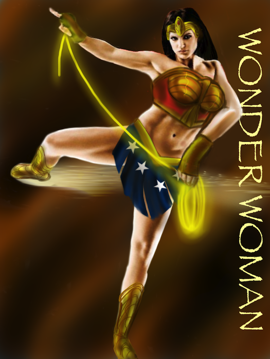
i just watched HAYWRE and Gina gets my vote for actress for the wonder
woman the movie! although at some angles she reminds me of Britney
Spears! all art is done on my iPad!
|
| Back to Top |
profile
| search
e-mail
|
| |
Carmen Bernardo
Byrne Robotics Member
Joined: 08 August 2006
Location: United States
Posts: 3666
|
| Posted: 25 September 2012 at 6:32pm | IP Logged | 11
|
post reply
|
|
@ Ronald Joseph, re: photoshop contrast adjustments for light pencil work 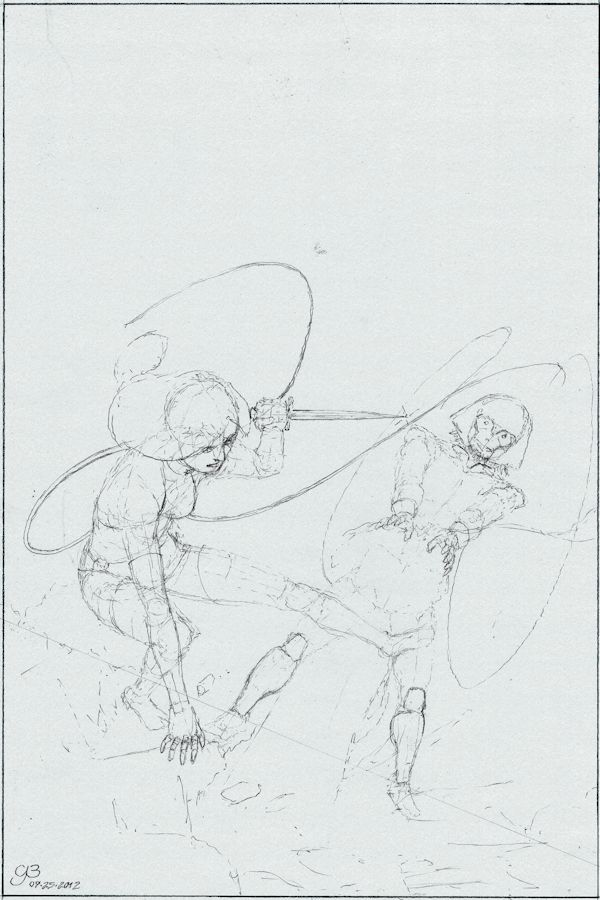
This is a histrogram-adjusted scan of a pencil layout for a piece that I'm working on right now. As you see, what would've been a very light pencil sketch with a few heavier lines rendered now stands out a little better. In PSPx4 and earlier versions, you can shift the histogram adjustment to make lighter lines stand out better. This being a comicbook cover concept using two of my original characters.
|
| Back to Top |
profile
| search
|
| |
Ronald Joseph
Byrne Robotics Member
Joined: 18 April 2011
Location: United States
Posts: 1781
|
| Posted: 25 September 2012 at 8:32pm | IP Logged | 12
|
post reply
|
|
@ Ronald Joseph, re: photoshop contrast adjustments for light pencil work
Yeah...there you go.
I find - sometimes - that when I'm posting scans of my pencils, switching the image from RGB color to grayscale makes them pop as well.
Cover looks exiting so far! You gonna post the progression?
|
| Back to Top |
profile
| search
| www
e-mail
|
| |