| Author |
|
Andrew W. Farago
Byrne Robotics Member

Joined: 19 July 2005
Location: United States
Posts: 4079
|
| Posted: 05 May 2024 at 3:18am | IP Logged | 1
|
post reply
|
|
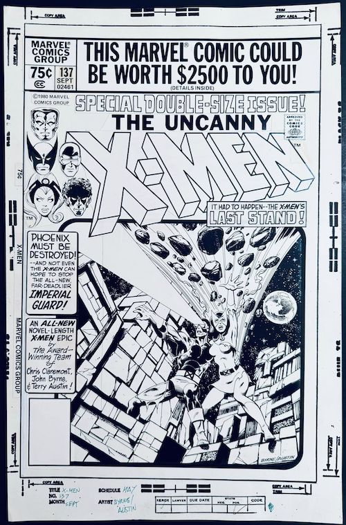
An original art collector posted this online the other day, claiming it was the mechanical for the original intended layout for X-Men #137. If John Byrne wants to weigh on its authenticity or offer any insights into this version of the cover, I know I'd love to hear more about it.
What's really striking about this design to me is that most of us have spent many years thinking that "This Comic Could Be Worth $2,500!" banner was really overpowering and distracting, not realizing that someone could have shrunk the artwork that much more, and put some extra borders and text boxes into the mix. The printed cover is downright restrained compared to this version.
|
| Back to Top |
profile
| search
| www
e-mail
|
| |
Athanasios Kollias
Byrne Robotics Member

Joined: 27 September 2021
Location: Greece
Posts: 274
|
| Posted: 05 May 2024 at 7:09am | IP Logged | 2
|
post reply
|
|
Aside from the fact I don't remember such a treatment for a cover, I find very odd the Byrne/Austin signature on the right, underneath Jean's left foot.As far as I know, the original signatures were on the left of the cover, left of the space the bottom corner box would occupy. And the signatures were a rather special case, defining the names by the shadow of the "white" letters. I doubt they wouldn't use the original ones, albeit tilted 90 degrees to the right. |
| Back to Top |
profile
| search
|
| |
John Byrne
Grumpy Old Guy
Joined: 11 May 2005
Posts: 132548
|
| Posted: 05 May 2024 at 7:55am | IP Logged | 3
|
post reply
|
|
Huh?
|
| Back to Top |
profile
| search
|
| |
Andrew W. Farago
Byrne Robotics Member
Joined: 19 July 2005
Location: United States
Posts: 4079
|
| Posted: 05 May 2024 at 2:52pm | IP Logged | 4
|
post reply
|
|
The person who now owns this piece made this post about it on Facebook the other day. Sharing it directly because it goes into more detail than what I posted:
" When I said I had a really great ART DAY this week, it was not only because of the great Marvel Blip art, but also because I got this: The original, mechanical cover to Uncanny X-Men #137 by John Byrne and Terry Austin. This mechanical cover is how the published cover was first supposed to look, but editorial correctly decided to go with bigger art and less copy for the published classic cover that we all know so well. It has been hidden away for 40 years. This awesome mechanical cover is made up of stats and some original art (as in the case with most mechanicals). I am so thrilled to have it in my collection!" |
| Back to Top |
profile
| search
| www
e-mail
|
| |
John Byrne
Grumpy Old Guy
Joined: 11 May 2005
Posts: 132548
|
| Posted: 05 May 2024 at 4:15pm | IP Logged | 5
|
post reply
|
|
Not to rain on anyone�s parade, but I have no memory of this cover in this form.
|
| Back to Top |
profile
| search
|
| |
Rebecca Jansen
Byrne Robotics Member

Joined: 12 February 2018
Location: Canada
Posts: 4635
|
| Posted: 05 May 2024 at 4:38pm | IP Logged | 6
|
post reply
|
|
Possibly a rejected in the office version? Definitely not as good as that which did appear, although the signatures are more in-line with the stone.
When I bought the comic off the spinner rack I was in the midst of reacting to the 10 cent price jump that month (not reading fanzines yet it was just there as of Spider-Woman #30), so I must've really wanted this issue to pay the 75 cents. X-Men was one of the few comics my older brother would borrow to read, he mostly read huge numbers of sf/f paperbacks.
Edited by Rebecca Jansen on 05 May 2024 at 11:16pm
|
| Back to Top |
profile
| search
| www
|
| |
Jason K Fulton
Byrne Robotics Member
Joined: 23 September 2016
Location: United States
Posts: 714
|
| Posted: 05 May 2024 at 7:30pm | IP Logged | 7
|
post reply
|
|
I mean, that absolutely looks like a panel after Claremont got ahold of it. But for this to go unseen for 40 years?
|
| Back to Top |
profile
| search
|
| |
Andrew W. Farago
Byrne Robotics Member
Joined: 19 July 2005
Location: United States
Posts: 4079
|
| Posted: 05 May 2024 at 8:32pm | IP Logged | 8
|
post reply
|
|
Having an interesting discussion about it on Facebook. Marvel editor Tom Brevoort offered this take:
"If it's a fake, it's an extremely good one. That lettering is spot-on perfect for the period and there's nothing in the layout that betrays it as being a fabrication. The one bit that gives me pause is the obvious fact that the artwork has been extended on the left side, where the original art had been reduced to fit. But even those corrections look accurate to the time period. So I tend to lean towards it being real, though it may have simply been an attempt that was discarded early on--an overabundance of copy and artwork that doesn't really fit the space well."
|
| Back to Top |
profile
| search
| www
e-mail
|
| |
Andrew W. Farago
Byrne Robotics Member
Joined: 19 July 2005
Location: United States
Posts: 4079
|
| Posted: 05 May 2024 at 8:38pm | IP Logged | 9
|
post reply
|
|
I guess my follow-up question for John would be if artists generally had the opportunity to see the cover copy and any alterations by editors before books went to press, or if you just had to trust that they were going to attempt whatever they thought was best for the artwork and would sell the most comics?
We can take for granted today that an editor can fire off a quick email (or use fax technology in the '90s) to run cover concepts past the artists before committing them to print, but that wouldn't have been the case in the 1980s.
|
| Back to Top |
profile
| search
| www
e-mail
|
| |
Rebecca Jansen
Byrne Robotics Member
Joined: 12 February 2018
Location: Canada
Posts: 4635
|
| Posted: 05 May 2024 at 8:42pm | IP Logged | 10
|
post reply
|
|
Could it have even been prepared before the decision that Phoenix must die? I see on this one it reads "Phoenix Must Be Destroyed!" while on the one that was used it read "Phoenix Must Die!"
Edited by Rebecca Jansen on 05 May 2024 at 8:43pm
|
| Back to Top |
profile
| search
| www
|
| |
Vinny Valenti
Byrne Robotics Member

Joined: 17 April 2004
Location: United States
Posts: 8057
|
| Posted: 05 May 2024 at 8:54pm | IP Logged | 11
|
post reply
|
|
Creator credits on the cover is very un-1980 Marvel.
The cover copy style does remind me of several DC covers of this era, but I'm struggling to place a specific one.
|
| Back to Top |
profile
| search
|
| |
Doug Centers
Byrne Robotics Member

Joined: 17 February 2014
Location: United States
Posts: 5504
|
| Posted: 05 May 2024 at 8:55pm | IP Logged | 12
|
post reply
|
|
Almost looks like the format DC would've used on their GIANT comics from the seventies.And to shrink the main cover art yet enlarge the corner heads? I dunno.
|
| Back to Top |
profile
| search
|
| |