| Author |
|
Arc Carlton
Byrne Robotics Member

Joined: 13 April 2009
Location: Peru
Posts: 3493
|
| Posted: 28 June 2009 at 3:26pm | IP Logged | 1
|
|
|
Ted, I'm kind of still the new guy here...
|
| Back to Top |
profile
| search
e-mail
|
| |
Ted Pugliese
Byrne Robotics Member

Joined: 05 December 2005
Location: United States
Posts: 7979
|
| Posted: 28 June 2009 at 11:22pm | IP Logged | 2
|
|
|
What does that have to do with my reply to something JB said?
Seriously, I don't get what you mean?
|
| Back to Top |
profile
| search
| www
|
| |
John Papandrea
Byrne Robotics Member

Joined: 16 April 2004
Location: United States
Posts: 647
|
| Posted: 03 July 2009 at 5:34pm | IP Logged | 3
|
|
|
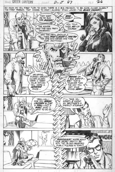
Neal Adams is quite a talented artist. Check out these pencils I found online.

|
| Back to Top |
profile
| search
|
| |
Brad Krawchuk
Byrne Robotics Member

Joined: 19 June 2006
Location: Canada
Posts: 5819
|
| Posted: 03 July 2009 at 6:48pm | IP Logged | 4
|
|
|
Tomorrow's the Big Day! Volumes 2 and 3 of the Batman work and the Deadman slipcased hardcover will be mine! More Adams = More Awesome for me!
|
| Back to Top |
profile
| search
e-mail
|
| |
Bill De Simone
Byrne Robotics Member

Joined: 06 May 2004
Location: United States
Posts: 84
|
| Posted: 03 July 2009 at 7:09pm | IP Logged | 5
|
|
|
Small bit of NA trivia for the hunters out there. ESPN the Magazine #100, from either 1999 or 2000, features a Neal Adams cover of the 100 Greatest Athletes of the Century, done in the style of the cover for Superman Vs. Muhammad Ali, in the DC oversize edition from 1978. Same composition, with Michael Jordan in the Superman position, although different body postures in the ESPN version. As in the Superman-Ali cover, the audience are(?) likenesses of current celebrities with a key on the inside cover. NA told me at a con that the art director remembered the earlier cover and commissioned the update in that style.
Now for the really trivial part. In SvA, there is a two page spread of Ali talking trash, the top two-thirds of the pages being close up head shots of Ali, only done in sort of a one-color-negative images. In ESPN, there is a full two page spread of Ali by Adams, with similar color-negative head shots of Ali in the background.
Next trivial: the ESPN has two page spreads by Jack Davis (Babe Ruth), Kyle Baker (Michael Jordan), Todd MacFarlane (Wayne Gretzky), and others.
|
| Back to Top |
profile
| search
e-mail
|
| |
Sam Karns
Byrne Robotics Member

Joined: 26 December 2004
Location: United States
Posts: 7624
|
| Posted: 04 July 2009 at 1:17am | IP Logged | 6
|
|
|
John, could share the link to Neal's pencils?
|
| Back to Top |
profile
| search
|
| |
Wallace Sellars
Byrne Robotics Member

Joined: 01 May 2004
Location: United States
Posts: 17673
|
| Posted: 04 July 2009 at 6:21am | IP Logged | 7
|
|
|
Wow. Not many artists can make a page of characters talking on the
telephone look interesting!
|
| Back to Top |
profile
| search
| www
|
| |
Ted Pugliese
Byrne Robotics Member
Joined: 05 December 2005
Location: United States
Posts: 7979
|
| Posted: 04 July 2009 at 7:44am | IP Logged | 8
|
|
|
That page is awesome. I love it.
|
| Back to Top |
profile
| search
| www
|
| |
John Byrne
Grumpy Old Guy
Joined: 11 May 2005
Posts: 132391
|
| Posted: 04 July 2009 at 7:46am | IP Logged | 9
|
|
|
Check out these pencils I found online.
��
And check out the balloon placement! That page is practically a "How to" of how not to do it! Look at the first two panels. Spread the first four balloon horizontally, squeeze them together a bit vertically, and maybe Ollie wouldn't have to be wearing the fifth one as a hat!How about that sixth panel? Move Hal's dialog down and left, and it doesn't have to be growing out of his head. Same with the next one. Is Ollie's couch more important as a picture element that Clark's head? One of the small annoyances I found when I went to work on Superman was that the editor kept changing my balloon placements. I would butt the balloons up against the panel borders, as I did at Marvel, and they were nicely clear of the speakers' heads -- no balloon hats! -- but the editor kept moving them down, to "float" (as they all do on that page), and when I asked him to stop he said aligning the balloons to the panel borders was "how Marvel does it" -- and the contempt practically dripped from his tone. As if there was something inherently wrong in keeping the balloons from doing odd intersections and tangents with the characters!
|
| Back to Top |
profile
| search
|
| |
Wayde Murray
Byrne Robotics Member

Joined: 14 October 2005
Location: Canada
Posts: 3115
|
| Posted: 04 July 2009 at 10:15am | IP Logged | 10
|
|
|
Those pencils are sweet. I especially like how Ollie gets progressively smaller in each panel as the opinions of his teammates wears him down, and he goes from leaning forward eagerly all the way through to slumped on the couch as the wind is taken out of his sails.
Nicely done.
Edit to add: oops. Scratch that. Slumped on an end table. Now that's odd.
Edited by Wayde Murray on 04 July 2009 at 10:16am
|
| Back to Top |
profile
| search
|
| |
John Moon
Byrne Robotics Member

Joined: 19 February 2008
Posts: 26
|
| Posted: 04 July 2009 at 10:30am | IP Logged | 11
|
|
|
Wow. Not many artists can make a page of characters talking on the
telephone look interesting!
---
There are several reasons this page SHOULD be boring:
- it's just characters talking on the telephone
- each panel has only one character
- all panels are shot from a "straight on" camera angle. Not so much as one dramatic up-shot or down-shot.
And despite all this the page still manages to look cool.
|
| Back to Top |
profile
| search
|
| |
Joe Hollon
Byrne Robotics Member

Joined: 08 May 2004
Location: United States
Posts: 13678
|
| Posted: 14 July 2009 at 7:37am | IP Logged | 12
|
|
|
Anyone who thinks all a comic needs to be good is the writing should check out SHOWCASE PRESENTS: BRAVE & THE BOLD BATMAN TEAM-UPS vol. 1
The first 300 pages (yes, 300 pages) of this volume are painful to read. I've read my fair share of SHOWCASE volumes and this is one of the few I questioned whether I would actually be able to finish it. I'm sure glad I kept plowing my way through it because all of a sudden Neal Adams shows up as the penciller and everything changes! Neal's art is an astounding evolutionary step forward (not that Infantino, Fradon, Andru and the rest in this volume are slouches) and it's just an amazing transition. The stories are immediately enjoyable. All written by the same guy (Bob Haney), the only difference is Neal. His panel lay-outs, interesting camera angles, dynamic figures, etc. Very interesting art lesson within these pages!
|
| Back to Top |
profile
| search
| www
e-mail
|
| |


