| Posted: 24 April 2024 at 3:39pm | IP Logged | 4
|
post reply
|
|
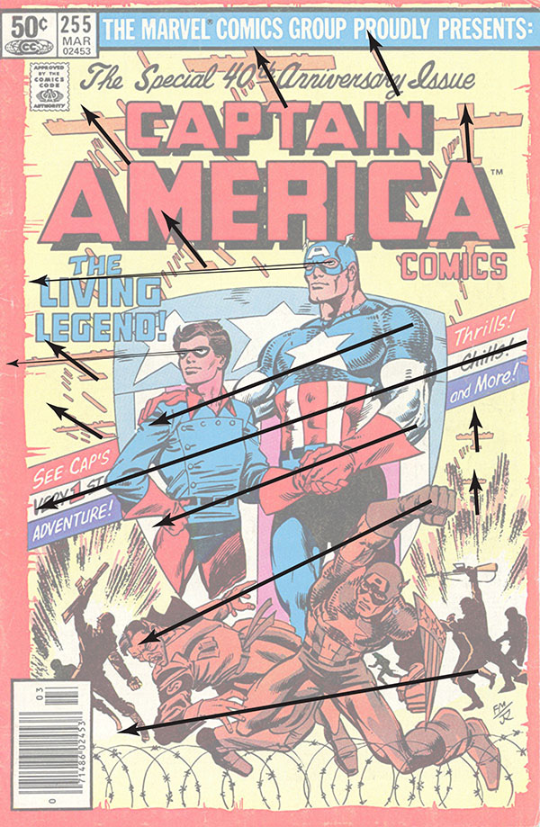
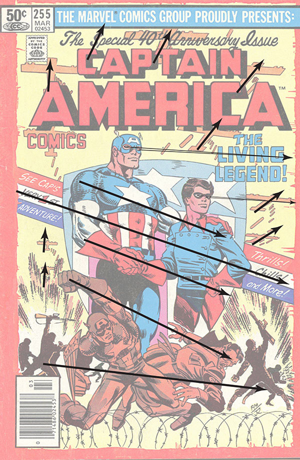
A good designer of comics book, which Frank Millar most certainly is, composes with intent to draw the reader's eye around the page and ultimately to turn the page. One way to examine the flow is to picture arrows on the image. The published cover has a flow from right to left.I didn't place all the arrows I could have. There are too many elements to detail. As you can see the layout directs you to the left and down which counters the way to turn the page. Contrary, my flop with arrows on the same elements directs the reader around the page and to the right to turn the page. The arrows don't have to be straight and can be on curves. To me, with very little supporting evidence, the original was flopped before inking and Joe Rubinstein was directed to embellish on the main figures.
I didn't miss the arm band swastika. I was simply in a hurry. Taking apart all the house dressings, flopping the main image, fixing the voids, while keeping the original look is a bit of work.
|