| Author |
|
Brian Miller
Byrne Robotics Member

Joined: 28 July 2004
Location: United States
Posts: 30906
|
| Posted: 03 August 2010 at 8:27pm | IP Logged | 1
|
|
|
Huh. Far out. ************** Far out? When are you, the 60's?
|
| Back to Top |
profile
| search
|
| |
Stephen Churay
Byrne Robotics Member

Joined: 25 March 2009
Location: United States
Posts: 8369
|
| Posted: 03 August 2010 at 9:37pm | IP Logged | 2
|
|
|
I look at the current Captain America series as an exampleas to how realistic coloring can really damage a book. That's a gloomyworld those heroes live in. It was a gloomy storyline. I don't think a bright color palette would match. I think the largerquestion is if the old approach to coloring would match modern storieswhere Superboy Prime murders a bunch of superheroes, or the Sentry ripsAres in half. --- You can set a gloomy mood without using a realistic color pallet. It doesn't have to be bright. Look at some of the O'Neil/ Adams Batman stories or Wein/ Wrightson Swamp Thing. They set a gloomy mood without having access to a realistic color pallet.
|
| Back to Top |
profile
| search
e-mail
|
| |
Benjamin Ledbetter
Byrne Robotics Member

Joined: 19 March 2007
Location: United States
Posts: 209
|
| Posted: 03 August 2010 at 10:04pm | IP Logged | 3
|
|
|
I can go either way on computer coloring, sometimes it can be excellent, sometimes not. I loved Glynis Oliver's work when I was younger, and Adrienne Roy, Joe Rosas, Tom Palmer, and I really enjoyed Patricia Mulvihill's work. I really did dig the computer coloring on the early image books, but now we have gone too far into the tool that augmented the art now seems to replace or detract from it. edited to make sense...
Edited by Benjamin Ledbetter on 03 August 2010 at 10:05pm
|
| Back to Top |
profile
| search
e-mail
|
| |
Tony Midyett
Byrne Robotics Member

Joined: 25 January 2010
Location: United States
Posts: 2834
|
| Posted: 04 August 2010 at 9:25am | IP Logged | 4
|
|
|
You know what I dislike most about modern coloring? Energy bolts. Give me a good old Kirby crackle (or Byrne crackle or Perez crackle) over these glowing F/X any day.
|
| Back to Top |
profile
| search
|
| |
Mike Norris
Byrne Robotics Member

Joined: 16 April 2004
Location: United States
Posts: 4274
|
| Posted: 04 August 2010 at 11:26am | IP Logged | 5
|
|
|
I'm not a fan of they way they use the blur tool. Especially to indicate speed or to render the background out of "focus".
|
| Back to Top |
profile
| search
e-mail
|
| |
John Byrne
Grumpy Old Guy
Joined: 11 May 2005
Posts: 132336
|
| Posted: 04 August 2010 at 11:31am | IP Logged | 6
|
|
|
You can set a gloomy mood without using a realistic color pallet. It doesn't have to be bright. Look at some of the O'Neil/ Adams Batman stories or Wein/ Wrightson Swamp Thing. They set a gloomy mood without having access to a realistic color pallet. �� Case in point: 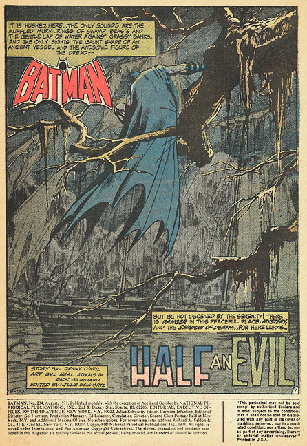
|
| Back to Top |
profile
| search
|
| |
Jim Muir
Byrne Robotics Member

Joined: 26 June 2007
Location: United Kingdom
Posts: 1370
|
| Posted: 04 August 2010 at 11:45am | IP Logged | 7
|
|
|
Its also an exercise in restraint. The Batman page above is essentially 2 colors (logo notwithstanding) and is a beautiful, evocative piece of work. The 'Mystique' page pasted upthread is a gaudy piece of dayglo excess.
Colorists need to reign it in and realise you dont have to use every Photoshop filter just 'cause it's there.
Its the endless lensflare that really bugs me - it's the mark of a lazy or inexperienced designer.
|
| Back to Top |
profile
| search
|
| |
Ed Love
Byrne Robotics Member
Joined: 05 October 2004
Location: United States
Posts: 2712
|
| Posted: 04 August 2010 at 12:09pm | IP Logged | 8
|
|
|
For me Jim it's the blurs used to depict super speed or things in a distance. Completely throws me out of the story. It's the same thing really though, a clashing of two different styles and media. Most comics are not drawn to be photo-realistic and thus computer effects to make parts of them look photo-realistic often have the opposite effect, highlighting the unreal nature of the finished product.
|
| Back to Top |
profile
| search
| www
|
| |
Mike Sweeney
Byrne Robotics Member

Joined: 25 May 2004
Location: United States
Posts: 318
|
| Posted: 04 August 2010 at 12:10pm | IP Logged | 9
|
|
|
I'm just thinking of how BAD that Batman page would probably look. There's too much temptation towards texture, color variation, et al with a modern computer-STYLE (let's not blame the tools, let's blame the choices). The background would probably have been done in near-black browns with hints of greenish-brown, and to make Batman visible at all they would have had to add shiny highlights all over him, and at the end of it the foreground branches would be just lost in the clutter.
The end result? Oh, definitely slimier, and darker, but most of the depth would be gone, and the the sense of quiet melancholy and decay I get from the existing page would be gone.
|
| Back to Top |
profile
| search
e-mail
|
| |
Flavio Sapha
Byrne Robotics Member

Joined: 16 April 2004
Location: Brazil
Posts: 12912
|
| Posted: 04 August 2010 at 12:12pm | IP Logged | 10
|
|
|
I remember someone posted this very example, when the Neal
Adams book came out. Batman's cape looked made out of shiny bluue
vinyl!
|
| Back to Top |
profile
| search
|
| |
Mike Sweeney
Byrne Robotics Member
Joined: 25 May 2004
Location: United States
Posts: 318
|
| Posted: 04 August 2010 at 12:16pm | IP Logged | 11
|
|
|
I just realized the right lower part of the Mystique page doesn't bother me too much. It is clean and readable. It is the left upper part that is all glare and highlights and extraneous shiny.
But I wonder if the art is in part to blame? It is almost like the colorist is using all those crazy tools in a vain attempt to shift the viewer's attention to Mystique's face, and not the "headlights" the line art has located in the place of honor. The result, alas, is that the supposed focus of the page is scrunched up against the panel border. It gives me the instinctive urge to shift my head and try to see a little further "through the window" and not have the panel border blocking my vision quite so badly.
No wonder this sort of page gives me a headache!
|
| Back to Top |
profile
| search
e-mail
|
| |
Stephen Churay
Byrne Robotics Member
Joined: 25 March 2009
Location: United States
Posts: 8369
|
| Posted: 04 August 2010 at 1:54pm | IP Logged | 12
|
|
|
For me Jim it's the blurs used to depict super speed or things in a distance.
---
You bring up a good point Ed. A creative side effect to the use of this has led to a lot of artists either not using or not learning how to create swoosh lines. That's a small part of why I've always loved JB's artwork. The man is the master of swoosh lines.
|
| Back to Top |
profile
| search
e-mail
|
| |


