| Author |
|
Joe Smith
Byrne Robotics Member

Joined: 29 August 2004
Location: United States
Posts: 6607
|
| Posted: 08 February 2013 at 3:27am | IP Logged | 1
|
|
|
wow
|
| Back to Top |
profile
| search
| www
e-mail
|
| |
John Byrne

Grumpy Old Guy
Joined: 11 May 2005
Posts: 132338
|
| Posted: 08 February 2013 at 6:46am | IP Logged | 2
|
|
|
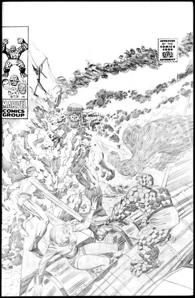 �� It's fun and informative to see Kirby's pencils from that "middle period". We can see how little the inkers really had to do, yet, at the same time, we can also see how much a consummate inker like Sinnott brought to the job.
|
| Back to Top |
profile
| search
|
| |
Sue Ward
Byrne Robotics Member
Joined: 25 June 2012
Location: United Kingdom
Posts: 279
|
| Posted: 08 February 2013 at 8:28am | IP Logged | 3
|
|
|
The whole drawing reeks of power and tension! And here is a photo of the two best guys on the Fantastic Four title Jack Kirby and Joe Sinnott.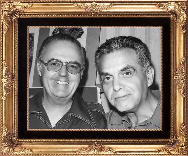
Edited by Sue Ward on 08 February 2013 at 9:22am
|
| Back to Top |
profile
| search
|
| |
Sue Ward
Byrne Robotics Member
Joined: 25 June 2012
Location: United Kingdom
Posts: 279
|
| Posted: 08 February 2013 at 9:30am | IP Logged | 4
|
|
|
A good example of Jack Kirby's pencils.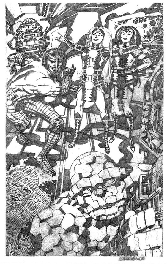
|
| Back to Top |
profile
| search
|
| |
Matt Hawes
Byrne Robotics Member

Joined: 16 April 2004
Location: United States
Posts: 16432
|
| Posted: 08 February 2013 at 9:39am | IP Logged | 5
|
|
|
I sometimes amazed at the unpublished artwork for comics covers that didn't make the grade for some reason. While I like the published version pretty well, I think that unpublished Sentry cover looks great. I know it's not always a question of the quality of the work, though.
|
| Back to Top |
profile
| search
| www
|
| |
Rick Senger
Byrne Robotics Member

Joined: 16 April 2004
Location: United States
Posts: 9646
|
| Posted: 08 February 2013 at 12:22pm | IP Logged | 6
|
|
|
I've never seen either of those before, Sue... they're beautiful! With his workload, how the #$%& did Kirby find the time to spot all those blacks? I didn't really recall noticing those occasional but patterned larger flame licks on the Torch in Sinnott's inked versions before,though they do seem to be there in some online samples. Maybe it's just a color vs. black and white thing.

|
| Back to Top |
profile
| search
e-mail
|
| |
John Byrne
Grumpy Old Guy
Joined: 11 May 2005
Posts: 132338
|
| Posted: 08 February 2013 at 12:26pm | IP Logged | 7
|
|
|
When I started working at Marvel, there were people who immediately got on my case for the way I drew the Torch's flame trail. They insisted the plumes of fire should all slant toward the rear. But I pointed out that I took my interpretation straight from Kirby, as seen above.
|
| Back to Top |
profile
| search
|
| |
David Plunkert
Byrne Robotics Member
Joined: 03 July 2012
Posts: 536
|
| Posted: 08 February 2013 at 2:31pm | IP Logged | 8
|
|
|
I sometimes amazed at the unpublished artwork for comics covers that didn't make the grade for some reason. While I like the published version pretty well, I think that unpublished Sentry cover looks great. I know it's not always a question of the quality of the work, though.
iiii
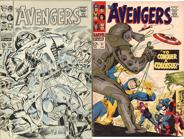
I suspect that a cover that had characters with their backs facing the reader was more likely to get bounced by Stan.
I assume that's why the Avengers 37 cover by Heck was bounced in favor of Kane's.
Edited by David Plunkert on 08 February 2013 at 2:34pm
|
| Back to Top |
profile
| search
|
| |
Joel Tesch
Byrne Robotics Member

Joined: 19 May 2006
Posts: 2823
|
| Posted: 08 February 2013 at 3:01pm | IP Logged | 9
|
|
|
It appears Kirby took a page from How To Draw Comics The Marvel Way. The actual head is very small for that stocky body. It allowed for a massive helmet (minus the wings) that is only a bit larger than the appropriate head. No worries. Based on your response I'm thinking you really meant something like this: It appears Kirby demonstrated one of the lessons from How To Draw Comics The Marvel Way. The actual head is very small for that stocky body. It allowed for a massive helmet (minus the wings) that is only a bit larger than the appropriate head.
Edited by Joel Tesch on 08 February 2013 at 3:02pm
|
| Back to Top |
profile
| search
|
| |
Jeffrey Rice
Byrne Robotics Member
Joined: 10 September 2011
Location: United States
Posts: 1161
|
| Posted: 08 February 2013 at 11:48pm | IP Logged | 10
|
|
|
Sue, thanks for sharing those images! They are just fantastic!
|
| Back to Top |
profile
| search
|
| |
Sue Ward
Byrne Robotics Member
Joined: 25 June 2012
Location: United Kingdom
Posts: 279
|
| Posted: 09 February 2013 at 12:12am | IP Logged | 11
|
|
|
Thanks Jeffrey and here is some more power from Jack Kirby's pencil.
Edited by Sue Ward on 09 February 2013 at 12:19am
|
| Back to Top |
profile
| search
|
| |
Sue Ward
Byrne Robotics Member
Joined: 25 June 2012
Location: United Kingdom
Posts: 279
|
| Posted: 09 February 2013 at 12:29am | IP Logged | 12
|
|
|
Unused Surf Hunter page by Jack Kir by. by.
|
| Back to Top |
profile
| search
|
| |