| Author |
|
Eric Jansen
Byrne Robotics Member

Joined: 27 October 2013
Location: United States
Posts: 2292
|
| Posted: 23 January 2018 at 7:33pm | IP Logged | 1
|
post reply
|
|
Infectious Lass has returned many times, probably based just on the appeal of Cockrum's design.
If you really want to remove Batman's trunks (that doesn't sound right), there are plenty of ways to do it. The movies mostly do it well, and Bill Sienkiewicz found a way to do "no trunks" for Moon Knight and it looked great! I'm thinking something like Neal Adams' design for the Angel's bodysuit could be cool. But gray longjohns? That's just lazy.
Edited by Eric Jansen on 23 January 2018 at 7:35pm
|
| Back to Top |
profile
| search
|
| |
Brian Hague
Byrne Robotics Member

Joined: 14 November 2006
Posts: 8515
|
| Posted: 24 January 2018 at 1:52am | IP Logged | 2
|
post reply
|
|
Infectious Lass has returned many times because Legion fandom is the prototype for all other kinds of super-hero fandom, the place where calls for adherence to continuity were first made and first discarded, the place where every character and appearance was first ruthlessly indexed, charted, and scrutinized for deviance from established fact.
There is seemingly no character, no mention of a device or a game, no scrap of detail that will not be repeatedly referred to and reinvented by the next wave of Legion creators. One cannot do a version of the Legion where Bouncing Boy and Matter-Eater Lad do not eventually return in some form or fashion. They have to be referenced. They HAVE TO BE.
And once you've gone down the rabbit hole of including every Legion member, you're apparently obliged to include every Substitute hero, and every Legion applicant, like Infectious Lass. Every Legionnaire or almost-Legionnaire is, after all, somebody's favorite character. Certainly, as the newest writer or artist on the series, you're going to get all of your's in there somewhere.
Granted, most iterations of the Legion don't last long enough these days to get around to doing Storm Boy, Arm-Fall-Off Boy, and the Mess, but given a long enough run, they could turn up somewhere.
"Remember that time Proty turned itself into the Legionnaire Weirdo? There he is in the background! There he is!!"
"Really? Cool. I love the Legionnaire Weirdo!"
Legion fandom, like most other forms of comics fandom, is endlessly self-referential.
Plus, Infectious Lass is kind of endearing in that shapely, "nobody will ever like me... snif." kind of way that inspires some to rush to her defense. "Doggone it! I like you, Infectious Lass! That Jacques Foccart is a lucky man to have you!"
And where is Jacques Foccart today? Probably dead from sleeping with Infectious Lass...
Edited by Brian Hague on 24 January 2018 at 1:56am
|
| Back to Top |
profile
| search
e-mail
|
| |
Wallace Sellars
Byrne Robotics Member

Joined: 01 May 2004
Location: United States
Posts: 17671
|
| Posted: 24 January 2018 at 11:26am | IP Logged | 3
|
post reply
|
|
Every link of Cap's chain mesh?
---
That's one I really don't get since what we saw for decades were the
impressions created by blue fabric overtop the underlying "chain mesh" Cap
wears.
|
| Back to Top |
profile
| search
| www
|
| |
Jason Czeskleba
Byrne Robotics Member

Joined: 30 April 2004
Posts: 4548
|
| Posted: 24 January 2018 at 3:04pm | IP Logged | 4
|
post reply
|
|
Brian Hague wrote:
| nfectious Lass has returned many times because Legion fandom is the prototype for all other kinds of super-hero fandom, the place where calls for adherence to continuity were first made and first discarded, the place where every character and appearance was first ruthlessly indexed, charted, and scrutinized for deviance from established fact. |
|
|
Yes indeed. And as you noted, the fact that Infectious Lass was brought back years later does not change the fact that she was originally conceived by Cockrum and Bates as a throwaway joke character. And there was clearly at least some humorous intent behind Cockrum's character design.
QUOTE:
| And where is Jacques Foccart today? Probably dead from sleeping with Infectious Lass... |
|
|
Ah, Jacques Foccart. A character seemingly created specifically to repudiate another character (Tyroc) for being too stereotypical. Paul Levitz appears to be saying "I'll show you how to create a black character that's not stereotypical. Look... I'll even give him a ridiculous Pepe LePew accent, the exact opposite of what you'd ever expect to see in a black character!" *edit to correct typo
Edited by Jason Czeskleba on 24 January 2018 at 7:18pm
|
| Back to Top |
profile
| search
|
| |
Brian Hague
Byrne Robotics Member
Joined: 14 November 2006
Posts: 8515
|
| Posted: 24 January 2018 at 6:18pm | IP Logged | 5
|
post reply
|
|
He even has the skunk stripe in his hair...
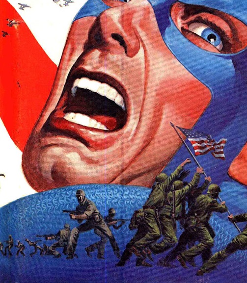
I liked what Steranko did with Cap's chain mail on the cover of the the 1970's Marvel Comics Index.
And just for the record, what many artists such as Kevin Maguire and John Cassaday have been giving us in recent years is not chain mail but rather scale mail, generally considered to be stronger and to provide better protection. Unfortunately, it also makes Cap look like a chicken.
|
| Back to Top |
profile
| search
e-mail
|
| |
Charles Valderrama
Byrne Robotics Member

Joined: 16 April 2004
Location: United States
Posts: 4721
|
| Posted: 22 February 2018 at 12:59pm | IP Logged | 6
|
post reply
|
|
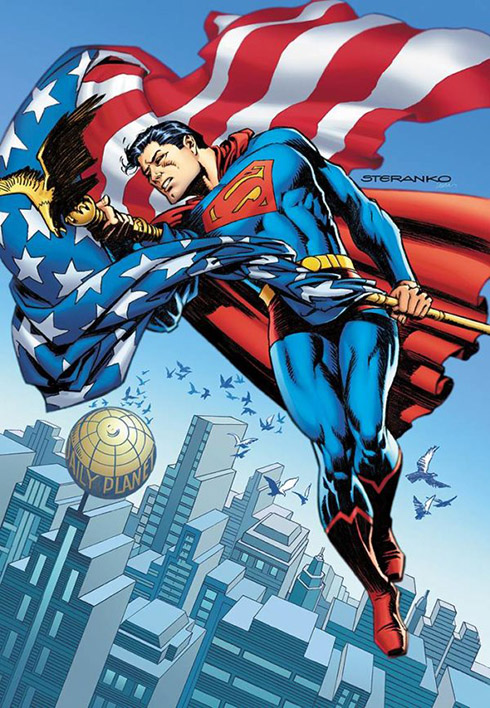
Speaking of Steranko, he's contributing a variant cover for ACTION COMICS #1000... 1970's style.... one of nine that have appeared online:
-C!
|
| Back to Top |
profile
| search
| www
|
| |
John Byrne

Grumpy Old Guy
Joined: 11 May 2005
Posts: 132320
|
| Posted: 22 February 2018 at 1:34pm | IP Logged | 7
|
post reply
|
|
Is that "70s Style" or Steranko Style?
|
| Back to Top |
profile
| search
|
| |
Charles Valderrama
Byrne Robotics Member
Joined: 16 April 2004
Location: United States
Posts: 4721
|
| Posted: 22 February 2018 at 1:36pm | IP Logged | 8
|
post reply
|
|
It's supposed to be 70's style... as each cover will represent a different era in ACTION COMICS' history.
-C!
|
| Back to Top |
profile
| search
| www
|
| |
Adam Schulman
Byrne Robotics Member

Joined: 22 July 2017
Posts: 1717
|
| Posted: 22 February 2018 at 4:47pm | IP Logged | 9
|
post reply
|
|
I love Steranko's art but that's a disappointing drawing. I find Superman's pose really odd.
Steve Rude's cover is supposed to be "1930s style." I don't see what's so '30s about it. But as usual, the Dude has provided great art, so this is the cover I'm selecting:
|
| Back to Top |
profile
| search
|
| |
Eric Sofer
Byrne Robotics Member

Joined: 31 January 2014
Location: United States
Posts: 4789
|
| Posted: 23 February 2018 at 8:33am | IP Logged | 10
|
post reply
|
|
I finally checked out the covers on Bleeding Cool. I have to say that I think only Steve Rude got the idea right. I think he might have used a more period Superman costume, but okay... it's solid.
Dave Gibbons got close, but the cover text feels a bit off.
There's a 60s cover by Mike Allred that has the right idea, but it is so crammed with so much that it gets bogged down in its own presentation... and while I can identify a lot of the stories and covers, I doubt more than several dozen current readers can. Dunno if that's an attraction or not.
I agree with Adam S. - Steranko's Superman is very awkward looking, and that flag covers too much.
Just don't like Jurgens and Nowlan's art. The art itself is okay... but I don't like the image.
And what the heck is that drawing by Lee Bermejo? It looks as if Superman forgot to iron his entire costume... including his boots (which is awkward... wrinkled boots) and THE RED TRUNKS.
None of those covers would inspire me to purchase this book, and little about it interests me... except for the unpublished Curt Swan story.
Okay. I'm getting it. Because I'm a sucker... right down to the soggy white stick at the middle.
|
| Back to Top |
profile
| search
|
| |
Adam Schulman
Byrne Robotics Member
Joined: 22 July 2017
Posts: 1717
|
| Posted: 23 February 2018 at 1:11pm | IP Logged | 11
|
post reply
|
|
The Rude cover has "2016" somewhere on it, unless my eyes are failing me. My guess is that it's a painting he simply hadn't used -- or sold -- yet.
His Superman is very much in the tradition of the Fleischer cartoons...except those are from the early '40s. Then again they were following the Joe Shuster design, more or less, and that dates from the '30s.
So if you reaaaally stretch the definition of "1930s-style Superman" I guess it fits.
|
| Back to Top |
profile
| search
|
| |
Brian Floyd
Byrne Robotics Member

Joined: 07 July 2006
Location: United States
Posts: 8363
|
| Posted: 23 February 2018 at 1:40pm | IP Logged | 12
|
post reply
|
|
Looks to me like he might have been going for a pulp magazine cover type design with that. I like it.
The Steranko one is awful. The pose is bad, and Superman's face looks weird.
|
| Back to Top |
profile
| search
e-mail
|
| |