| Author |
|
Robert Bradley
Byrne Robotics Member

Joined: 20 September 2006
Location: United States
Posts: 4827
|
| Posted: 03 December 2021 at 9:35am | IP Logged | 1
|
post reply
|
|
True, as a fan it's easy to forget their putting out a product, and back then there were penalties from the printer if they weren't out on time, so they did what they felt was necessary. For an artist I would think a costume like the Atom, Fantastic Four or Green Lantern would be ideal - very simple detail. It seems that now we just get a lot of detail for the sake of adding lines.
|
| Back to Top |
profile
| search
| www
|
| |
Robert Bradley
Byrne Robotics Member
Joined: 20 September 2006
Location: United States
Posts: 4827
|
| Posted: 03 December 2021 at 9:39am | IP Logged | 2
|
post reply
|
|
And then there is this guy. I have liked his original costume since his introduction, but it's got to be maddening to draw dozens of times in an issue -
|
| Back to Top |
profile
| search
| www
|
| |
John Byrne

Grumpy Old Guy
Joined: 11 May 2005
Posts: 132292
|
| Posted: 03 December 2021 at 9:55am | IP Logged | 3
|
post reply
|
|
Jack of Hearts falls outside one of my "rules"--that an artist should not design costumes based on the way he/she draws. Keith Giffen was a whizz with all that elaborate gingerbread, but for another artist it can be a pain. I know! I have only drawn Jack of Hearts twice (?) and, oy!!
|
| Back to Top |
profile
| search
|
| |
Doug Centers
Byrne Robotics Member

Joined: 17 February 2014
Location: United States
Posts: 5471
|
| Posted: 03 December 2021 at 10:39am | IP Logged | 4
|
post reply
|
|
re: Jack of Hearts, is there any significance for the arrow?
I remember when first seeing Captain Britain, and thinking I wouldn't want to be drawing that lion of his in all those angles and foreshortening views.
|
| Back to Top |
profile
| search
|
| |
Mike Norris
Byrne Robotics Member

Joined: 16 April 2004
Location: United States
Posts: 4274
|
| Posted: 03 December 2021 at 9:52pm | IP Logged | 5
|
post reply
|
|
Kid Flash from the Silver Age. I assume Infantino designed it
Neal Adam's Angel
Silver Age Captain America
Gil Kane's Green Lantern
Neal Adams Green Arrow
JB's Wolverine
|
| Back to Top |
profile
| search
e-mail
|
| |
Jason Scott
Byrne Robotics Member
Joined: 06 August 2012
Location: Scotland
Posts: 1167
|
| Posted: 04 December 2021 at 5:18am | IP Logged | 6
|
post reply
|
|
70es-80es Captain America (i.e Before the pouches!)
SpiderWoman's original Red & Yellow, (once she let her hair out)
Mysterio
Thor (Classic design)
Spider-man I'd have to add as an honourable mention as I love both the original Steve Ditko design and Zeck's take on the 80es Black costume. (There was a period during the 80es when he was switching between the two depending on the writer/artists preference for the story and it was great!)
But even though I technically prefer both more than a couple of the entries above, I'm 50/50 on them, and couldn't possibly choose between them. So effectively they both cancelled each other out. Since I didn't want to give two places to the same character on such a shortlist!
|
| Back to Top |
profile
| search
|
| |
Petter Myhr Ness
Byrne Robotics Member

Joined: 02 July 2009
Location: Norway
Posts: 3826
|
| Posted: 04 December 2021 at 8:07am | IP Logged | 7
|
post reply
|
|
Superman is my favourite.
Batman and Spider-Man are close runners-up. With Batman I actually prefer the yellow insignia, the way Adams and others drew him, but I can easily live with the more stripped-down bat symbol - the way JB drew it in the MAN OF STEEL mini-series. (And I think perhaps JB did this before it became the standard again?).
|
| Back to Top |
profile
| search
|
| |
John Byrne
Grumpy Old Guy
Joined: 11 May 2005
Posts: 132292
|
| Posted: 04 December 2021 at 8:24am | IP Logged | 8
|
post reply
|
|
Silly thing about that yellow ellipses was that DC added it to make the bat emblem something they could trademark. Instead, they made it easier to rip off! (One Halloween I happened to pass a small bakery that was selling round cookies iced with pink bats on a green background. Totally looked like the bat-symbol. If they�d just been bats, there would have been no comparison. )
|
| Back to Top |
profile
| search
|
| |
Wallace Sellars
Byrne Robotics Member

Joined: 01 May 2004
Location: United States
Posts: 17671
|
| Posted: 04 December 2021 at 10:30am | IP Logged | 9
|
post reply
|
|
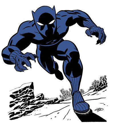
Black Panther (classic version)
Cyclops (original black and yellow uniform)
Mr. Fantastic (negative version)
Spider-Man (original black and red version)
Oh, and I appreciate those of you who kept your selections to four or less. It's easier to list more names, but requires some thought to play by the rules.
|
| Back to Top |
profile
| search
| www
|
| |
Peter Martin
Byrne Robotics Member

Joined: 17 March 2008
Location: Canada
Posts: 15801
|
| Posted: 04 December 2021 at 12:35pm | IP Logged | 10
|
post reply
|
|
Wallace wrote:
| Black Panther (classic version) |
|
|
Is that with or without the cape, Wallace? And do you prefer the blue or the grey highlights?
|
| Back to Top |
profile
| search
|
| |
Jonathan A. Dowdell
Byrne Robotics Member
Joined: 17 July 2016
Location: United States
Posts: 417
|
| Posted: 04 December 2021 at 1:05pm | IP Logged | 11
|
post reply
|
|
When I think of favorite costumes from the comics my mind goes right to Kirby's FF "villain" designs -- Galactus, Psycho-Man, the Wizard, Annihilus. And Spider-Man's rogues gallery by Ditko (and Romita) -- Mysterio, Doc Ock, the Rhino.
|
| Back to Top |
profile
| search
|
| |
Wallace Sellars
Byrne Robotics Member
Joined: 01 May 2004
Location: United States
Posts: 17671
|
| Posted: 04 December 2021 at 1:59pm | IP Logged | 12
|
post reply
|
|
QUOTE:
| Black Panther (classic version) |
|
|
QUOTE:
| Is that with or without the cape, Wallace? And do you prefer the blue or the grey highlights? |
|
|
I prefer T'Challa sans cape. I'm okay with blue or grey highlights, but prefer the former, particularly when BP is in the company of colorfully-garbed peers.
|
| Back to Top |
profile
| search
| www
|
| |