| Author |
|
Carmen Bernardo
Byrne Robotics Member

Joined: 08 August 2006
Location: United States
Posts: 3666
|
| Posted: 11 June 2012 at 6:47pm | IP Logged | 1
|
post reply
|
|
A couple of observations here... I liked how John took the pose an extra step beyond the original, too. It was one of the central themes that I got from reading How To Draw Comics The Marvel Way back in my youth. It's hard to avoid doing a static pose, but if you put some extra "OOMPH!" into it, it looks like something really is happening on a page. On the subject of Wonder Man himself, he was always a favorite of mine in the pages of the Avengers comic, especially with the buddy relationship that was developed between him and the Beast. Sometimes I wish that neither character left the team. Then again, I had a fanboy fantasy about WM getting his own book... now I know it didn't quite turn out right. I can see where John didn't quite like the George Perez version of WM's costume. He went with something a little more unique for its day (the costume became a red jacket over black slacks and muscle shirt, with no mask). I guess what appealed to me about George looks in retrospect like someone trying to make things a little too busy on a page.
|
| Back to Top |
profile
| search
|
| |
Brad Teschner
Byrne Robotics Member

Joined: 01 June 2005
Location: United States
Posts: 3933
|
| Posted: 11 June 2012 at 8:14pm | IP Logged | 2
|
post reply
|
|
Wow...who was it that said you could make even the lamest costume look
good, JB! Very nice!!!
|
| Back to Top |
profile
| search
|
| |
John Byrne
Grumpy Old Guy
Joined: 11 May 2005
Posts: 132335
|
| Posted: 11 June 2012 at 8:20pm | IP Logged | 3
|
post reply
|
|
I can see where John didn't quite like the George Perez version of WM's costume. He went with something a little more unique for its day (the costume became a red jacket over black slacks and muscle shirt, with no mask).•• If I'm reading this right, a correction is in order: the safari jacket look was not mine. In fact, I have not had a hand in ANY of Simon's costume designs. In every instance, I just drew what was handed to me.
|
| Back to Top |
profile
| search
|
| |
Garry Porter II
Byrne Robotics Member
Joined: 07 February 2011
Posts: 327
|
| Posted: 11 June 2012 at 9:32pm | IP Logged | 4
|
post reply
|
|
Yes yes yes!! Finally!! I get to see a Wonder Man commission piece. One of my most favorite characters in Marvel. I think JB did the best version of Wonder Man in Avengers West Coast. But, we really need many more Wonder Man commissions.
|
| Back to Top |
profile
| search
|
| |
Mike Norris
Byrne Robotics Member

Joined: 16 April 2004
Location: United States
Posts: 4274
|
| Posted: 11 June 2012 at 10:12pm | IP Logged | 5
|
post reply
|
|
Never cared for Safari Simon. The first Wonderman costume was the best.
I didn't care for Dr Pym's jumpsuit either.
Edited by Mike Norris on 11 June 2012 at 10:13pm
|
| Back to Top |
profile
| search
e-mail
|
| |
Thom Price
Byrne Robotics Member
L’Homme Diabolique
Joined: 29 April 2004
Location: United States
Posts: 7593
|
| Posted: 12 June 2012 at 2:28am | IP Logged | 6
|
post reply
|
|
Excellent commission, with a very dynamic pose.
I must admit that this version of Wonder Man's costume is one of my least favorite superhero outfits. I do think, however, that it looks much better in black & white, so some of the costume's problem lies in its garish color scheme. Change the colors, take away the goggles, and some of the doo-dads, and it's not so bad.
It was years before my eyes recognized the pattern on Simon's chest to be a "WM" and even now I practically have to force my eyes to see it.
|
| Back to Top |
profile
| search
| www
e-mail
|
| |
John Byrne
Grumpy Old Guy
Joined: 11 May 2005
Posts: 132335
|
| Posted: 12 June 2012 at 5:04am | IP Logged | 7
|
post reply
|
|
It was years before my eyes recognized the pattern on Simon's chest to be a "WM" and even now I practically have to force my eyes to see it.•• As I was working on this piece I felt a small temptation to monkey with the chest emblem, to make it more obviously a WM design -- but, of course, that was not what the customer asked for! Inspired by Victor's tinkering (on the previous page), tho, last night I did try this: 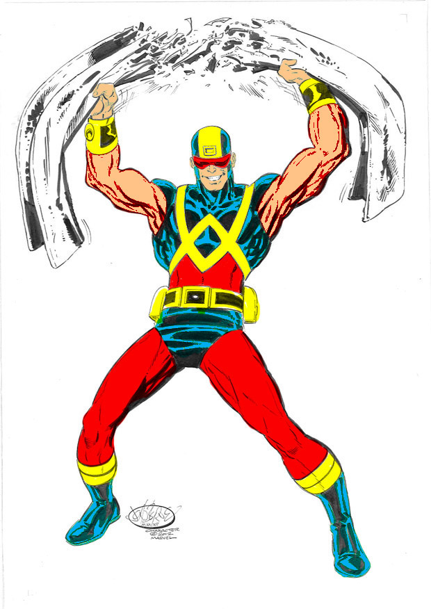
Doesn't make the WM any more obvious, but gets rid of what I call the "Christmas Colors".
|
| Back to Top |
profile
| search
|
| |
Trevor Smith
Byrne Robotics Member

Joined: 21 September 2006
Location: Canada
Posts: 3521
|
| Posted: 12 June 2012 at 8:03am | IP Logged | 8
|
post reply
|
|
"It was years before my eyes recognized the pattern on
Simon's chest to be a "WM"..."
**
Don't feel bad, I just clued in now that you said it!
|
| Back to Top |
profile
| search
e-mail
|
| |
Charles Valderrama
Byrne Robotics Member

Joined: 16 April 2004
Location: United States
Posts: 4721
|
| Posted: 12 June 2012 at 8:06am | IP Logged | 9
|
post reply
|
|
It always seemed obvious that few liked the costumes... Wonder Man was almost always getting 'battle damaged' as a result! Still, i liked the safari jacket era and also the West Coast black shirt costume.
NIce recoloring, JB - i also disliked the "Christmas colors".... surprised that wasn't considered at the time of the design.
-C!
|
| Back to Top |
profile
| search
| www
|
| |
John Byrne
Grumpy Old Guy
Joined: 11 May 2005
Posts: 132335
|
| Posted: 12 June 2012 at 8:08am | IP Logged | 10
|
post reply
|
|
It always seemed obvious that few liked the costumes... Wonder Man was almost always getting 'battle damaged' as a result!•• Guilty, your honor!
|
| Back to Top |
profile
| search
|
| |
John Byrne
Grumpy Old Guy
Joined: 11 May 2005
Posts: 132335
|
| Posted: 12 June 2012 at 8:13am | IP Logged | 11
|
post reply
|
|
Say, here's a fun challenge to those of you who feel artistically inclined (and even those who don't): redesign that chest emblem so it is more obviously a WM.Keep the following "rules" in mind: • Keep it simple. Remember, this is something that would have to be drawn many times in a single issue • Remember the angles! The emblem does not necessarily have to read clearly from every angle, but avoid designs where it gets muddy or busy when viewed from anything too far off head on • Anatomy! Don't forget this is wrapping around a human body, so don't play it like Havok's power discs, that seem to "float" and appear flat to the viewer no matter what angle he's seen from. Feel free to tinker with my drawing, if that will make it easier. The "winner" (by popular consensus) gets a lifetime free membership in the JBF.
|
| Back to Top |
profile
| search
|
| |
Victor Manuel Fernandez Patińo
Byrne Robotics Member
Joined: 16 April 2004
Location: Mexico
Posts: 1600
|
| Posted: 12 June 2012 at 8:33am | IP Logged | 12
|
post reply
|
|
Blue and red look great! -still don't like the yellow...-
|
| Back to Top |
profile
| search
| www
e-mail
|
| |


